Evolv Chiropractic
Brand Identity Design
Author
Kevin Craft
Services
Art Direction, Brand Design, Positioning
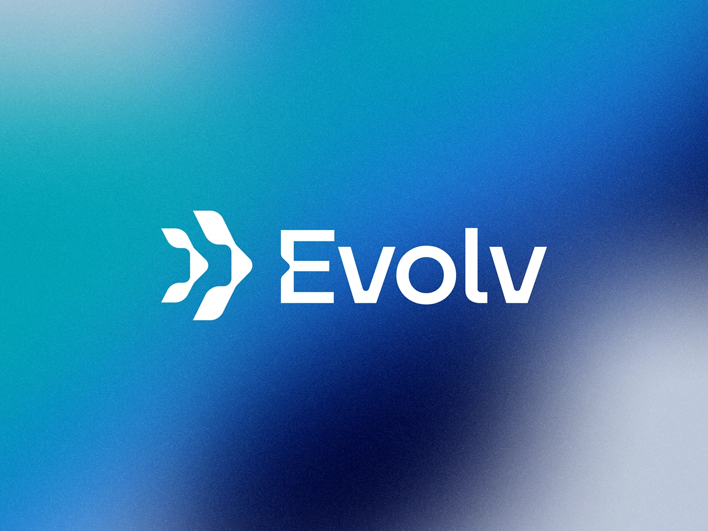
Aligning Progress: The Bold Identity of Evolv Chiropractic
Process
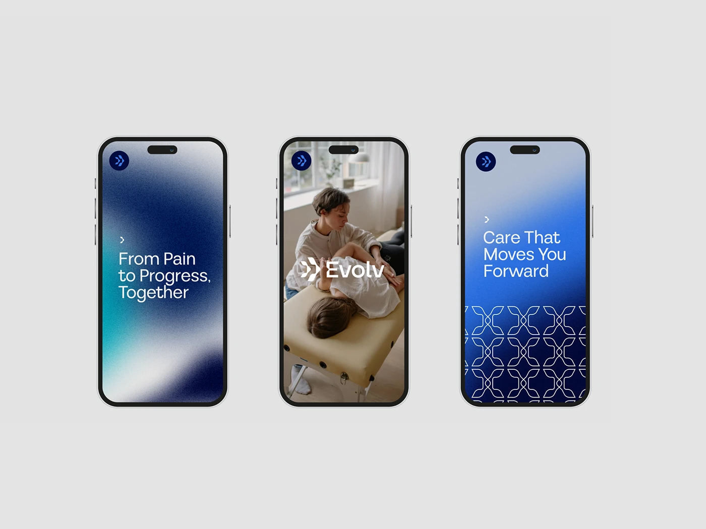
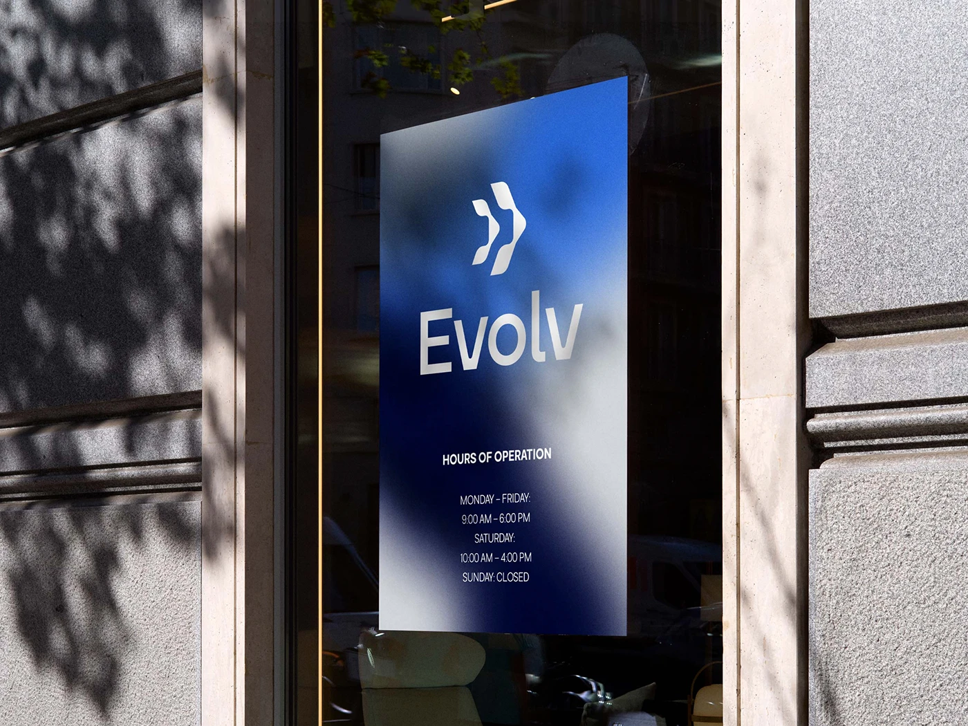
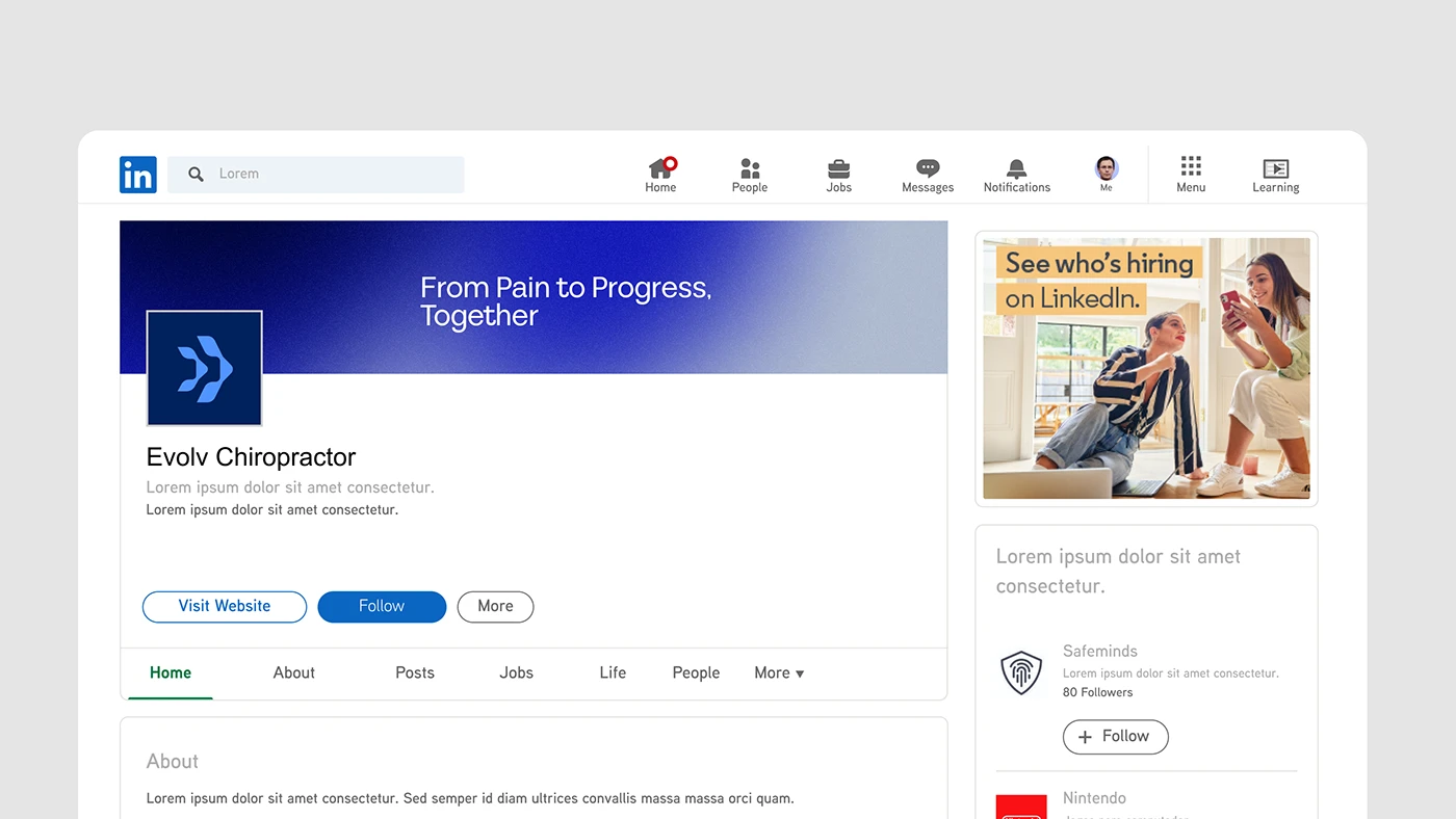
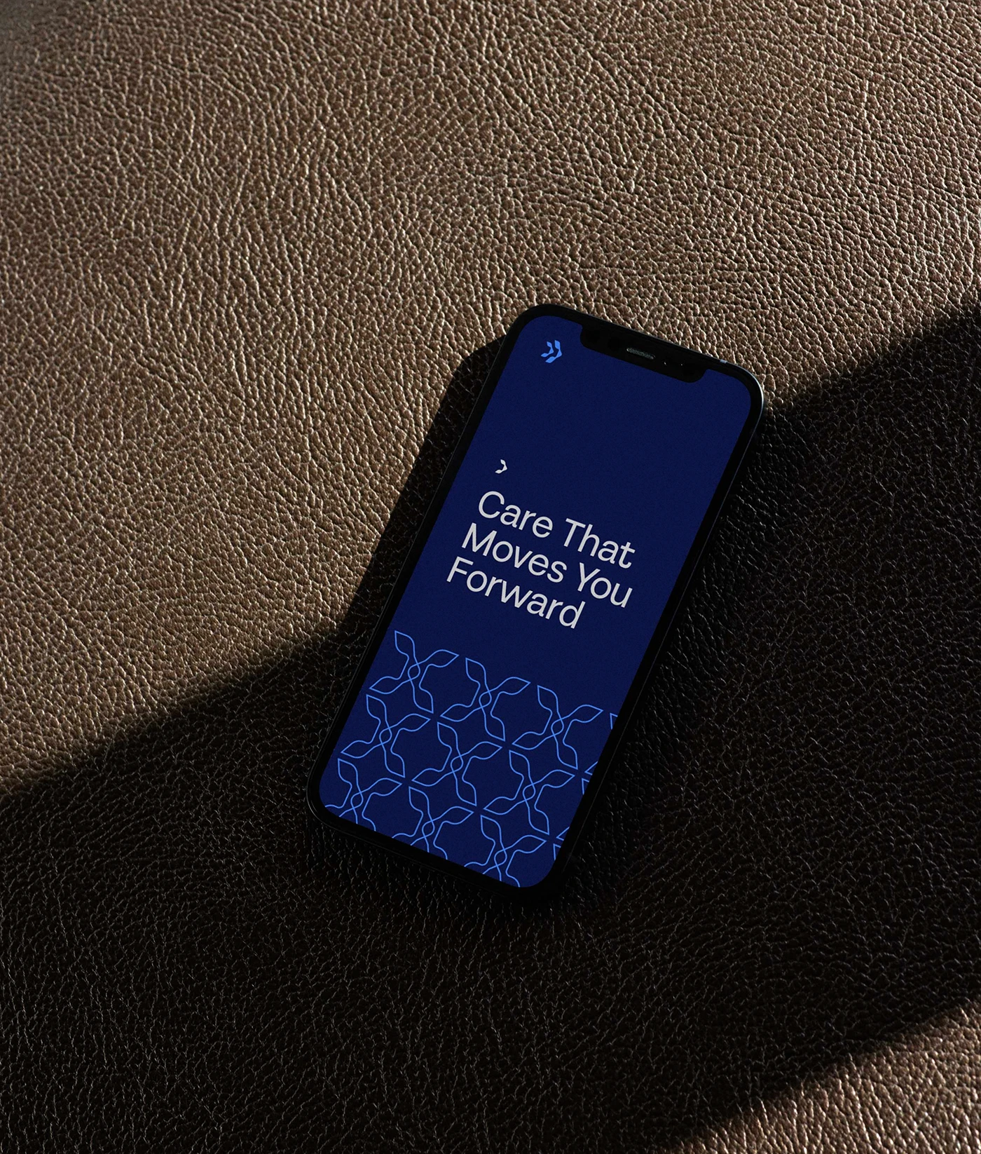
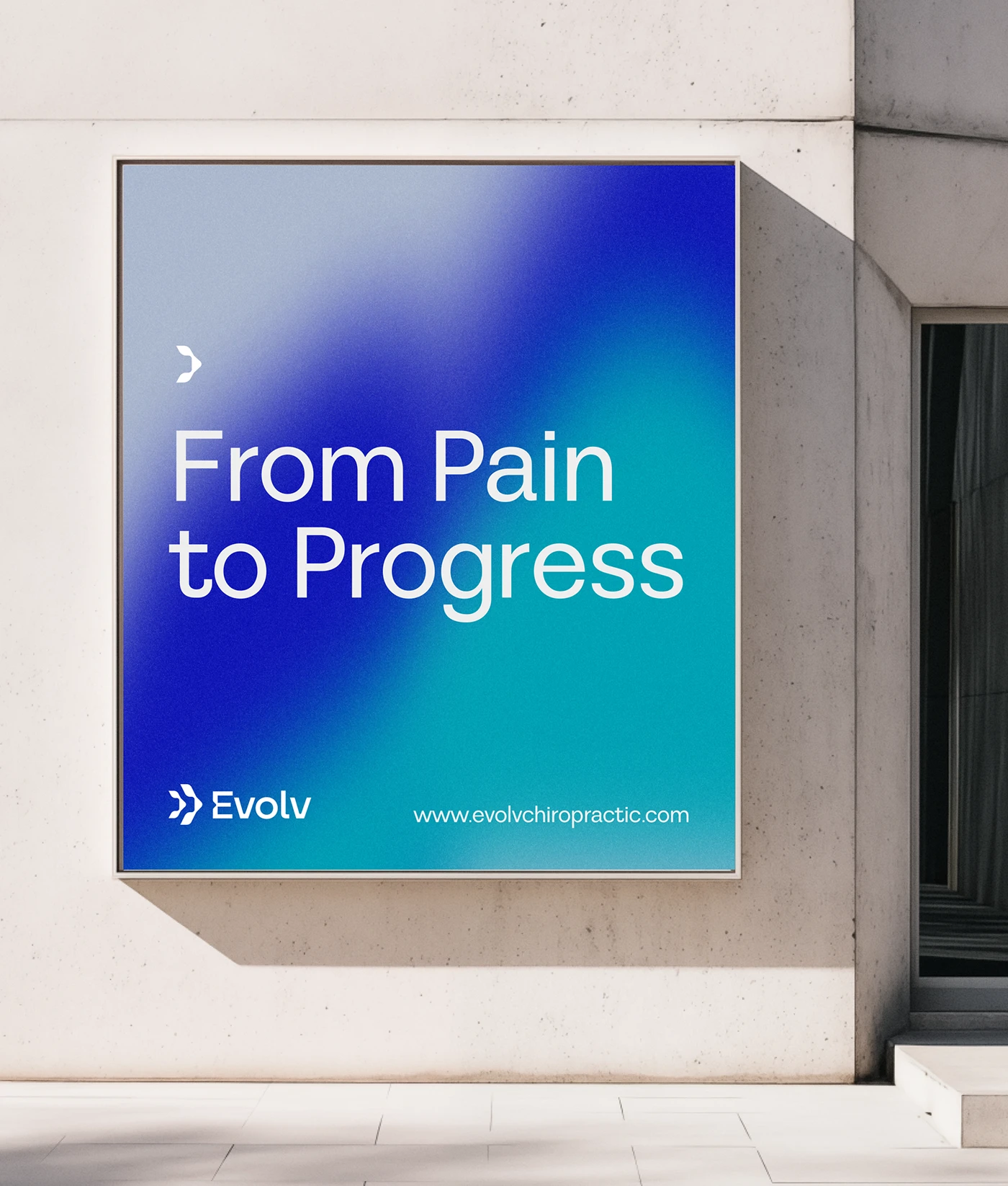
Evolv Chiropractic, a Dallas-based practice, needed a bold and modern visual identity that reflected its dynamic approach to spinal care. Our goal was to create a brand that communicates movement, progress, and innovation—mirroring the practice’s commitment to patient-centered, forward-thinking chiropractic care.
Inspiration
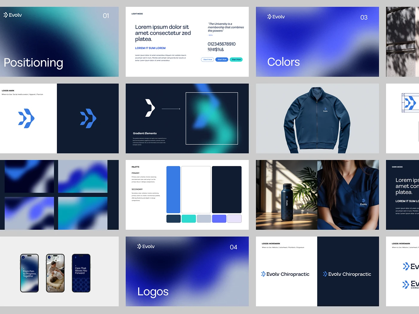
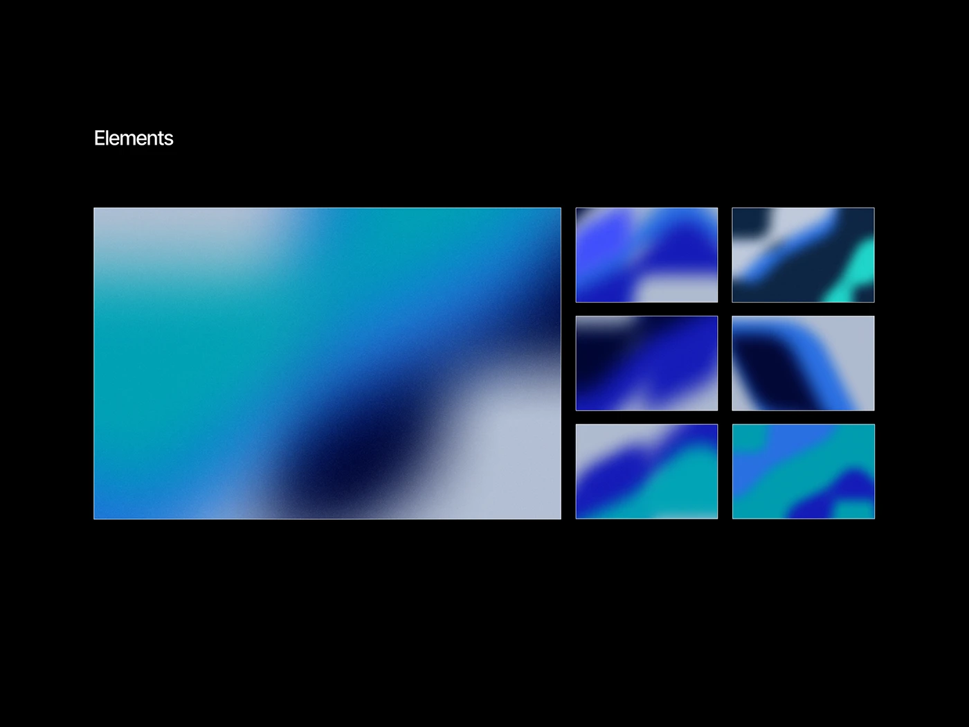
The foundation of the identity was built on the concept of motion and alignment. Drawing from the natural curvature of the spine, we explored visual elements that conveyed balance and progression. The brand’s color palette features cool, calming tones contrasted with energetic gradients to symbolize the harmony between structure and movement. The mood board emphasized bold typography, strong contrasts, and patterns inspired by vertebrae, reinforcing the practice’s focus on spinal health and continuous improvement.
Execution
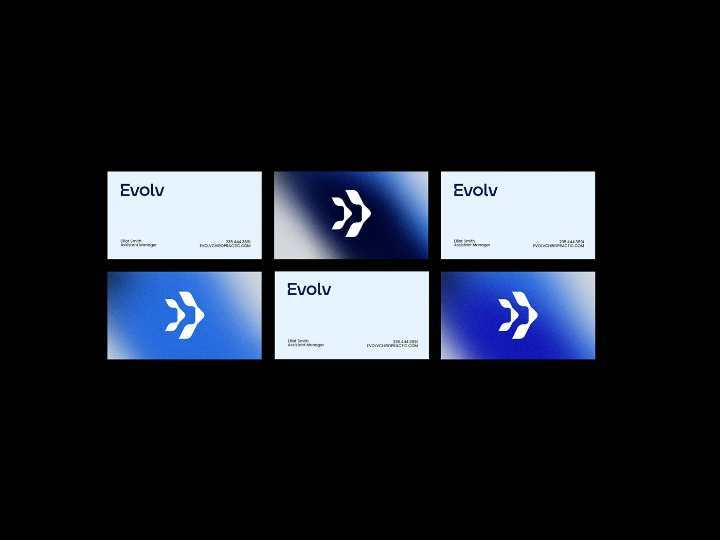
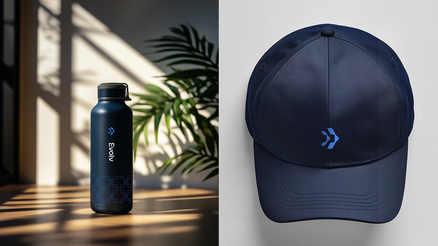
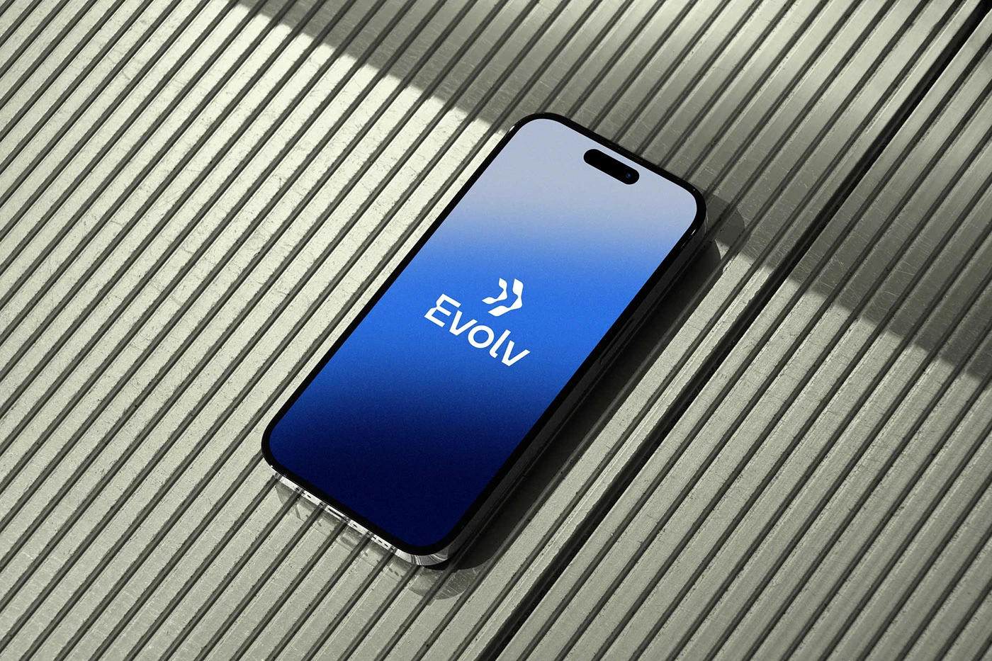
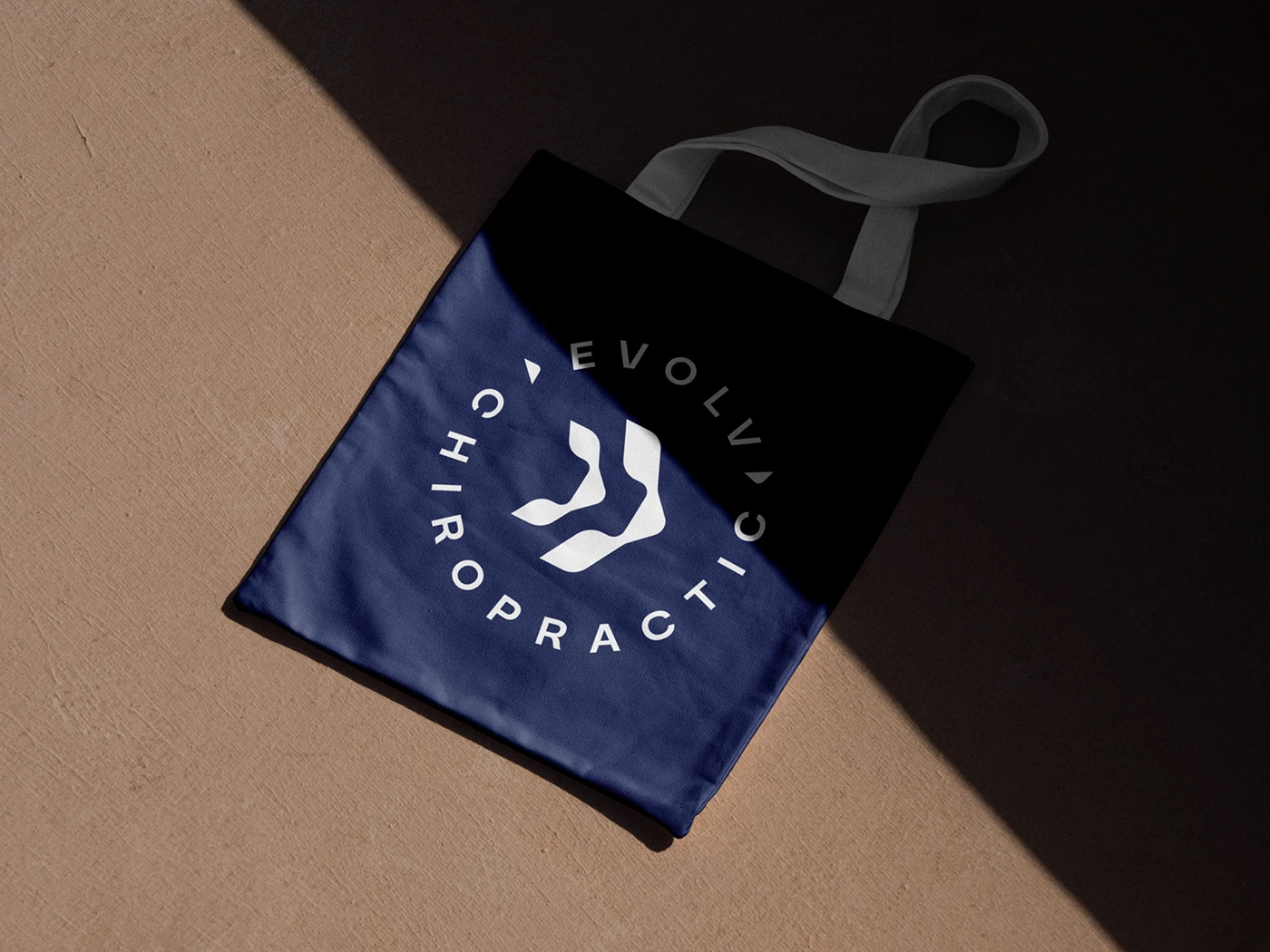
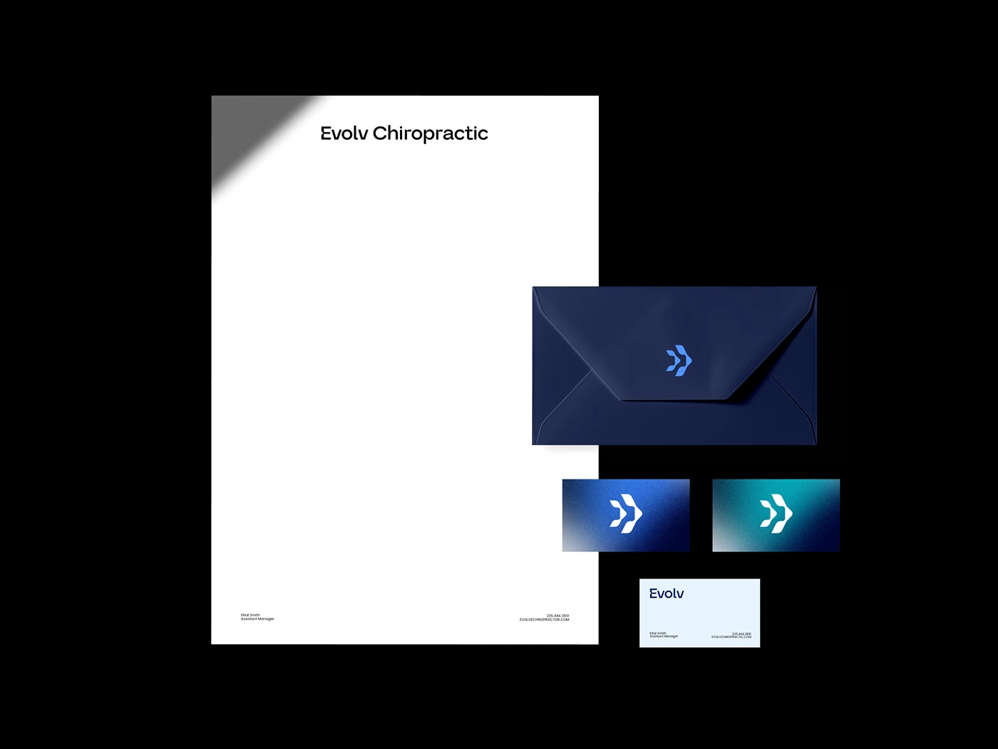
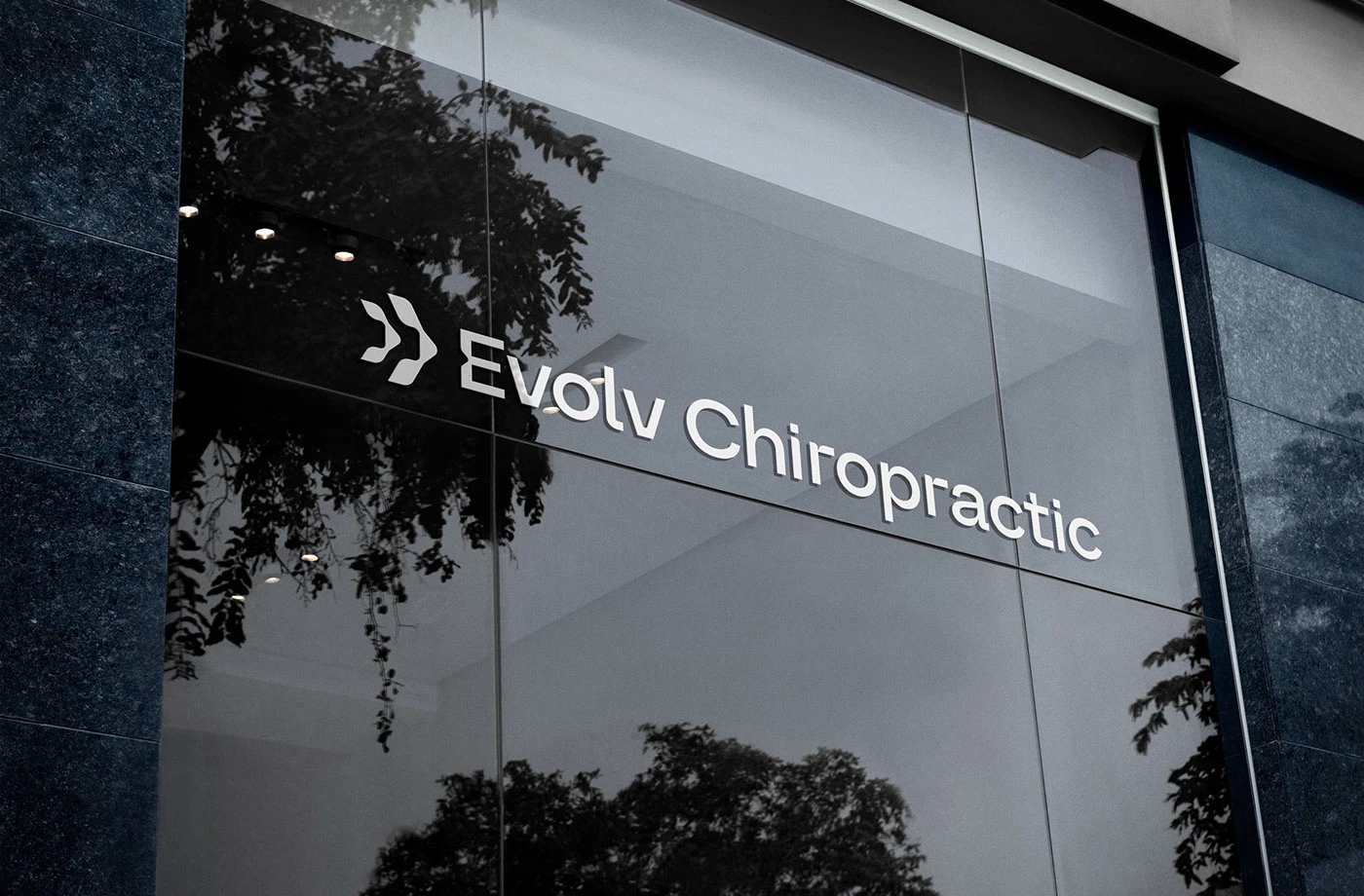
The final identity combines clean, modern typography with an abstract mark derived from vertebrae symbols. A forward-moving arrow is integrated into the design, representing growth and progressive care. Noisy gradients introduce a sense of vitality, while structured patterns reflect alignment and balance. Together, these elements create a sophisticated yet energetic brand presence that sets Evolv Chiropractic apart in the healthcare space.