What Makes a Brand Identity Feel Premium?

Most founders think a premium brand identity is about aesthetics. Not the case.
-
-
-
- Better typography.
- More whitespace.
- Muted colors.
- Minimal layouts.
-
-
Those things can help but they’re not what actually makes a brand feel premium. Premium brands send signals, not decoration.
Premium Brand Identity Starts With Confidence
The fastest way to spot a non-premium brand is hesitation.
-
-
-
- Over-explaining.
- Too many options.
- Designs that try to impress instead of decide.
-
-
A premium brand identity feels calm because the decisions are already made. Let’s divide this into signals below:
Signal #1: Clear Positioning
Premium brands know exactly who they’re for and who they’re not. You see it in:
-
-
-
- Focused messaging
- Specific language
- A clear point of view
-
-
When a brand tries to appeal to everyone, it feels generic. When it chooses deliberately, it feels valuable. This is positioning, not aesthetics.
Signal #2: Consistency Across Every Touchpoint
Anyone can make something look good once.
Premium brand identities stay consistent:
-
-
-
- Across platforms
- Across teams
- Across time
-
-
That consistency signals maturity and intention. Inconsistency signals improvisation.
Signal #3: Intentional Constraints
Premium brands don’t give themselves unlimited freedom.
They define:
-
-
-
- A tight color system
- Clear typographic hierarchy
- Rules for layout and usage
-
-
Constraints aren’t limiting they’re evidence of decision-making. Brands that can’t say no don’t feel premium.
Signal #4: Craft Over Complexity
Premium doesn’t mean complicated.
It means:
-
-
- Careful typography
- Balanced proportions
- Thoughtful spacing
- Details that reward attention
-
If a brand needs to shout to be noticed, it usually doesn’t hold up over time.
Signal #5: Alignment Between Brand and Behavior
The strongest premium brands feel coherent. What they say, how they look, and how they behave all match.
You can feel when:
-
-
- The identity overpromises
- The product underdelivers
- The experience doesn’t align
-
That disconnect erodes trust fast.
What a Premium Brand Identity Is Not
It’s not:
-
-
- Black-and-white by default
- “Luxury” fonts
- Minimalism for its own sake
- Copying what other premium brands are doing
-
Those are shortcuts. Shortcuts don’t scale.
Why This Matters for Businesses
Early-stage companies often want to look premium to gain credibility.
But credibility comes from:
-
-
- Clear decisions
- Strong systems
- Brands that know who they are
-
A premium brand identity isn’t about polish it’s about alignment.
What a Premium Brand Identity Looks Like in the Real World
Premium brand identity isn’t theoretical. It shows up in how decisions hold together over time. Here are three examples from my work where the signals mattered more than surface aesthetics.
Bloomviva


Focus signal: Restraint + clarity in a sensitive category
Bloomviva operates in a space where trust matters more than novelty. The brand identity was built around calm typography, a controlled color system, and a visual language that communicates credibility without feeling clinical.
Nothing is loud. Nothing is rushed.
That restraint is what makes the brand feel premium.
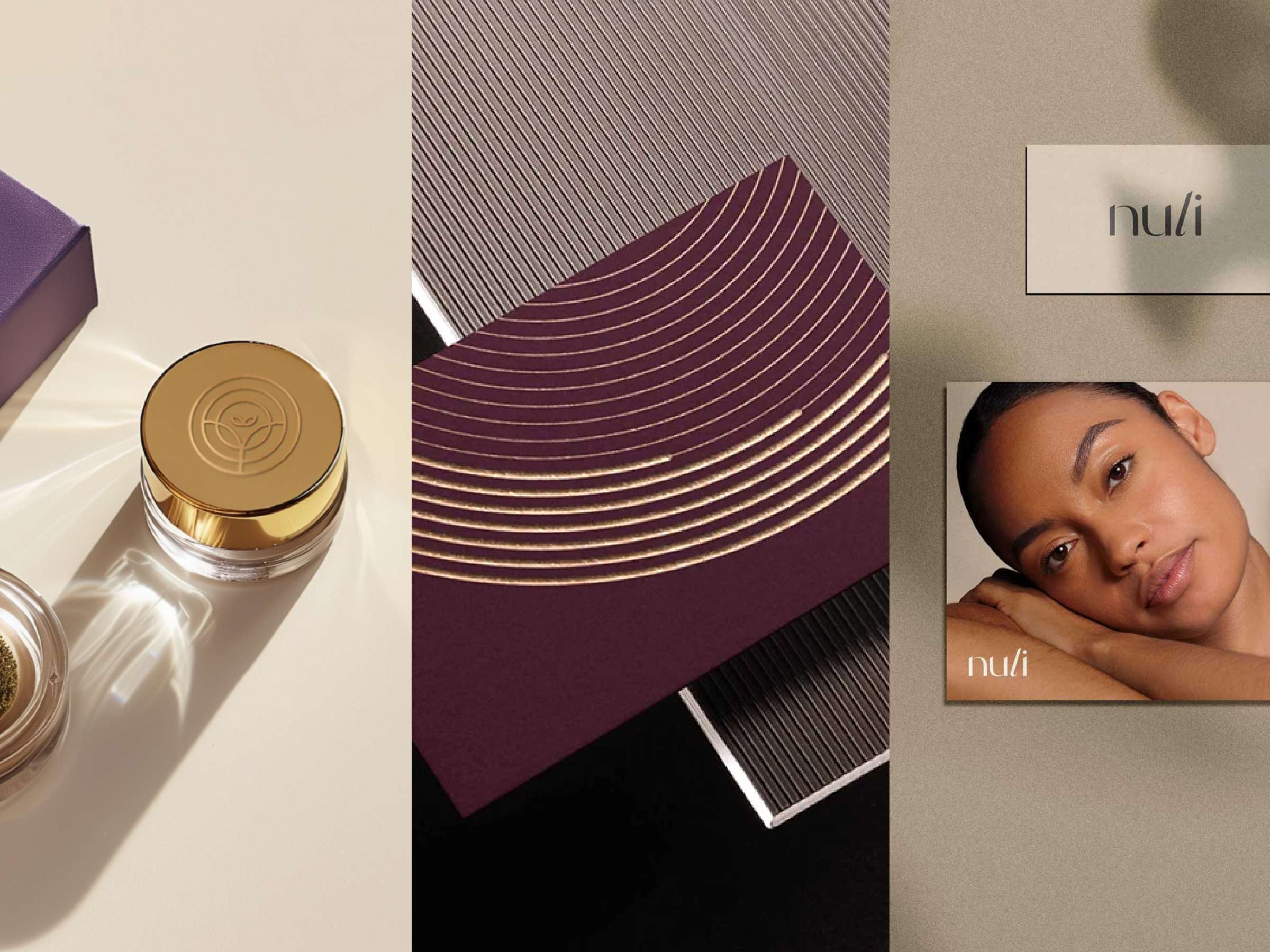
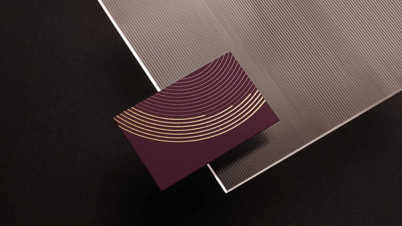
Nuli Studios
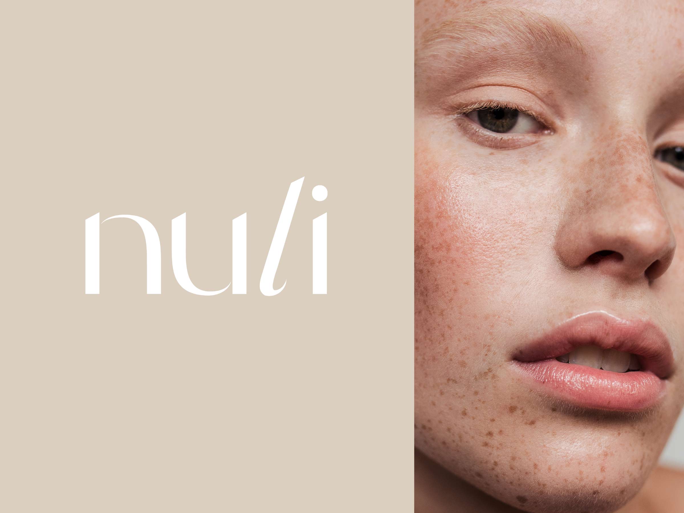

Focus signal: Positioning through consistency
Nuli didn’t need to look trendy it needed to feel intentional and repeatable. The identity system prioritizes consistency across content, digital touchpoints, and application, allowing the brand to scale without visual drift.
The result is a brand that feels confident because it’s resolved, not because it’s flashy.
Meridian Financial

Focus signal: Maturity and trust through structure
Financial brands often overcompensate with complexity. Meridian’s identity does the opposite. The system emphasizes hierarchy, balance, and clarity signaling stability and long-term thinking.
Premium here isn’t about luxury cues.
It’s about reassurance and discipline.
Final Thought
Premium brands don’t ask for attention.
They assume it.
And that confidence always shows.

A premium brand identity isn’t about aesthetics it’s about building a system that supports clarity, consistency, and long-term growth.
Kevin Craft | Freelance Branding Designer

