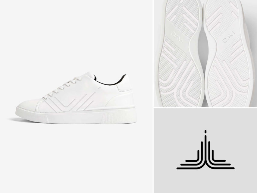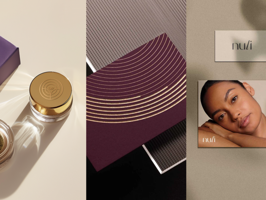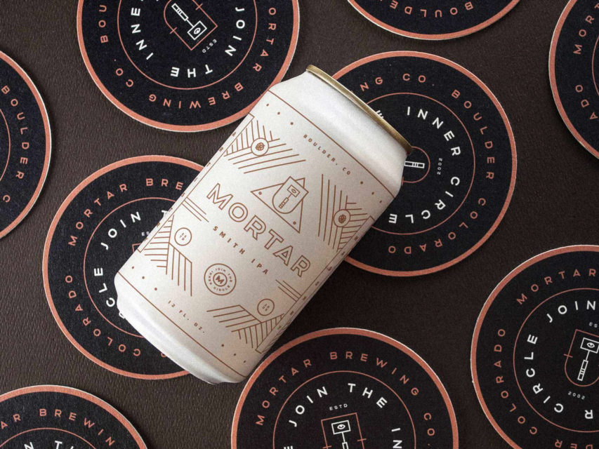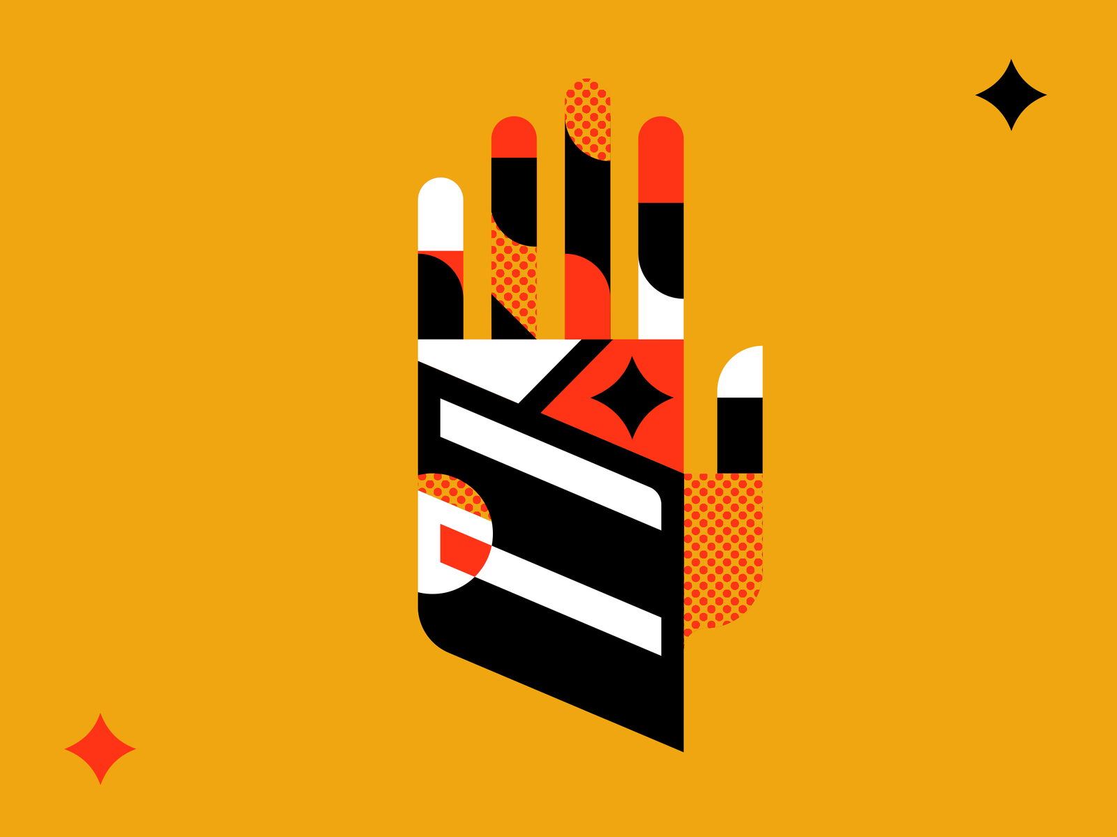
I LOVE Brad Cuzen’s work! His style is so amazing and he’s just so incredibly talented.
I decided to do a hand in my own version similar to his in the rebound. The base is actually made out of a logo I’m using for a meet up group I run in Dallas called Italics. Really happy with how this turned out, I love screen tone textures with clean, vector graphics. I think it’s the perfect marriage of graphic elements when used properly.
