Maximillian Corwell
Brand Identity / Collateral Design
Designer
Kevin Craft
Services
Brand Identity / Logo Design
/ Collateral / Signage
Background
Max has established himself in real estate in Atlanta already, but wanted his brand to stand out amongst his competition. He came to me to create a completely unique identity system that could stand out in the Atlanta real estate market.
Process
We started by going over his brand keywords, assessing his customer target (young professionals, and older established home buyers) and finally, going over his top competitors (others in the Atlanta realty industry). I then began by collaborating with Max on a mood board of creative that he’s save through out the years and some new designs I pulled from online resources. A lot goes into finding the perfect mark. When I say two logo options…it’s usually narrowed down from dozens of logo sketches, and ten or more vector sketches. I usually have a lot of fluid sketches that I star with a highlighter and bring the ones I think have more legs than others into Illustrator. Ultimately the MC monogram was chosen.

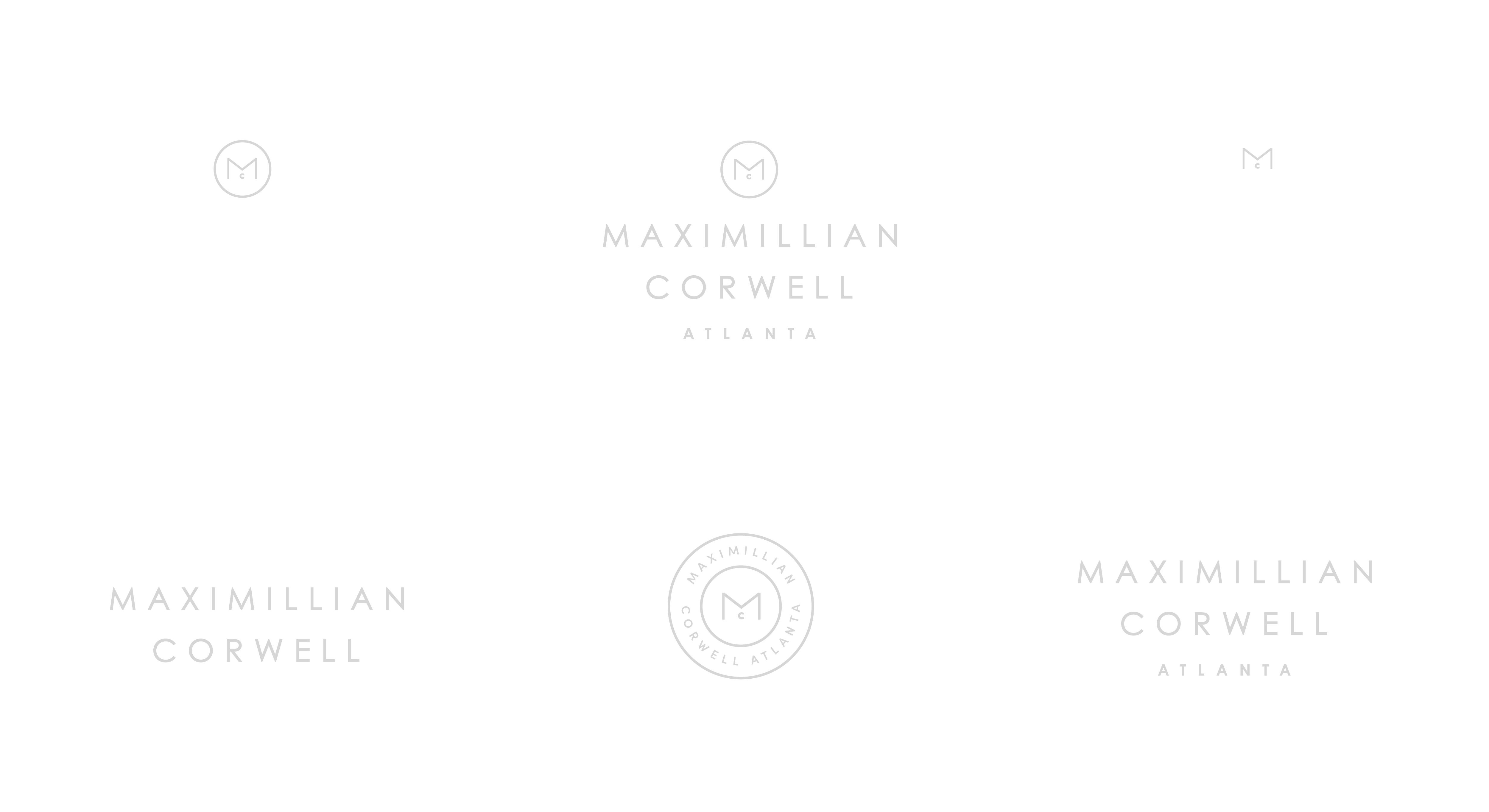


The Mark
The inspiration behind this mark being the M of his initials, to me, could read as two roofs. I purposely placed them over the C to represent the new homeowner, as it is Max’s profession to find amazing homes for buyers.

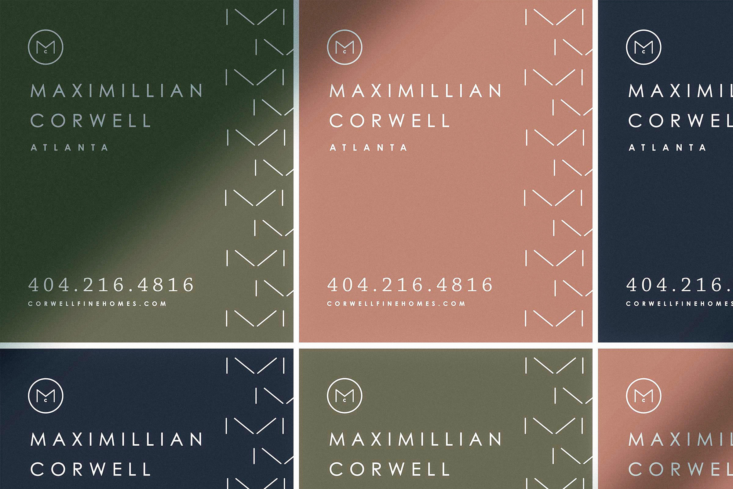
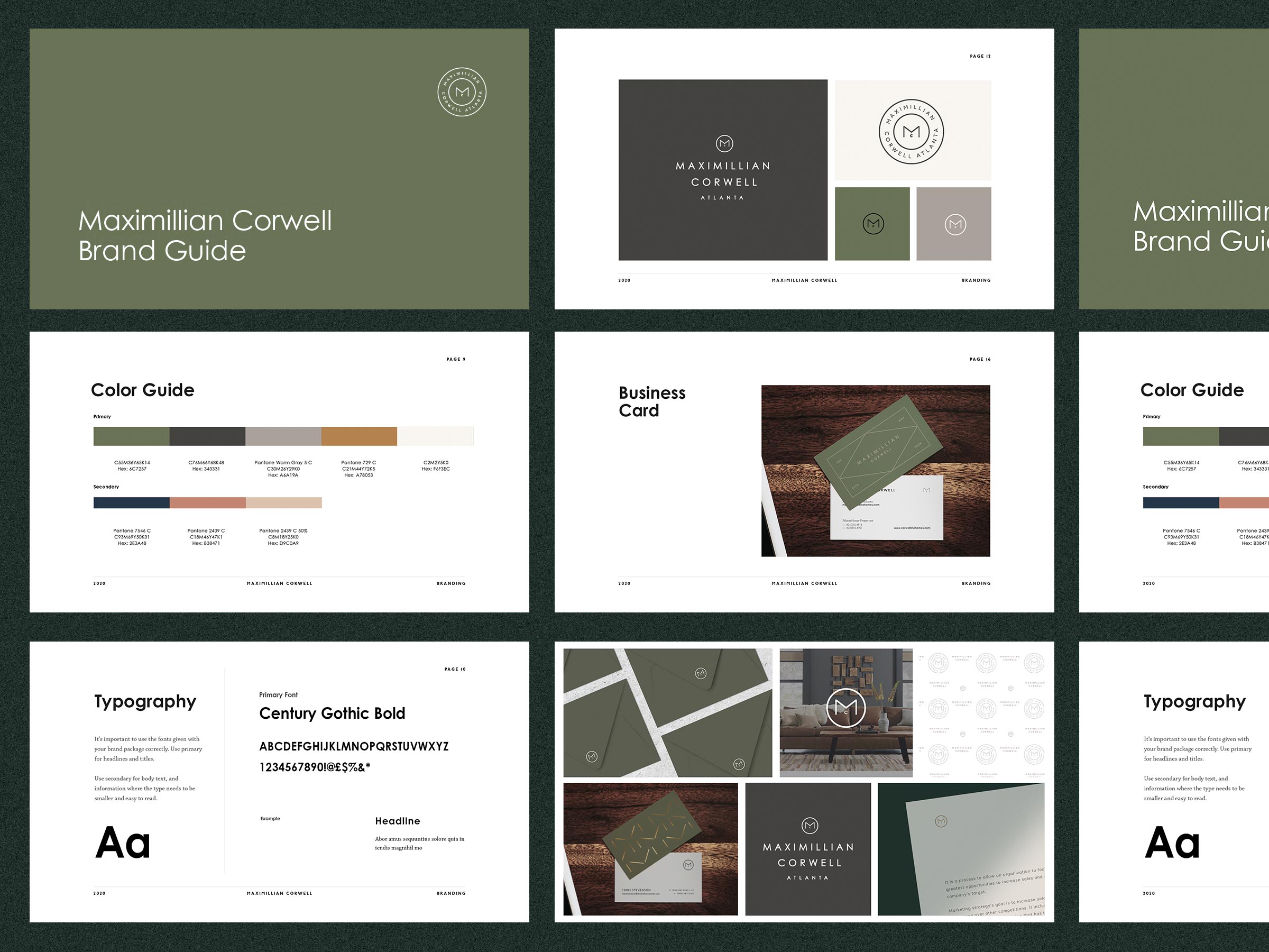
I wanted him to have a seal monogram that he could use on pretty much everything. I was inspired by color schemes I didn’t see that often in real estate design, especially the army green with warm grey and metallic gold.
Max ended up choosing option 1, but for his revision edit, wanted to add in some secondary colors from the other option to give more range. The inspiration behind this mark being the M of his initials, to me, could read as two roofs. I purposely placed them over the C to represent the new homeowner, as it is Max’s profession to find amazing homes for buyers.
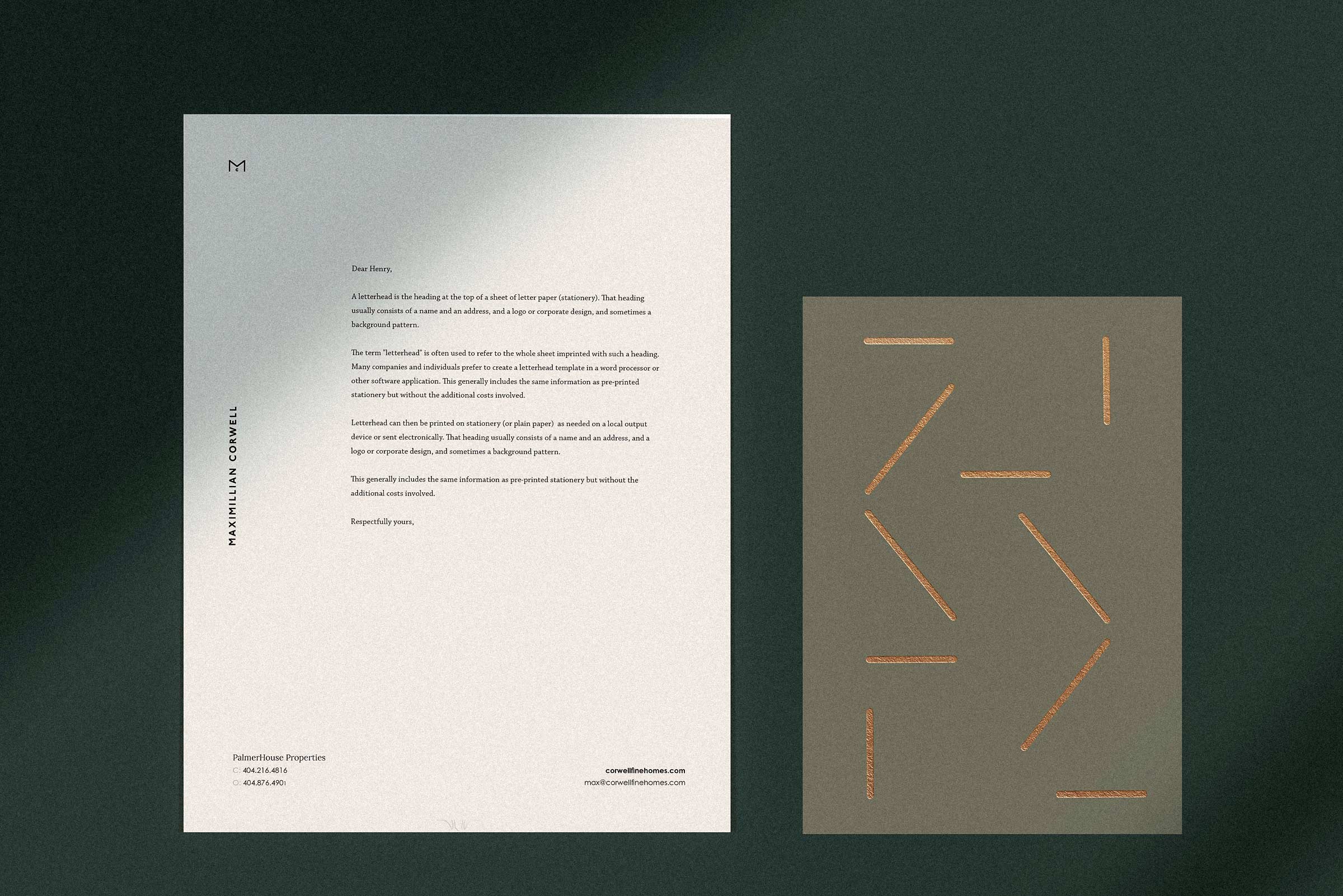
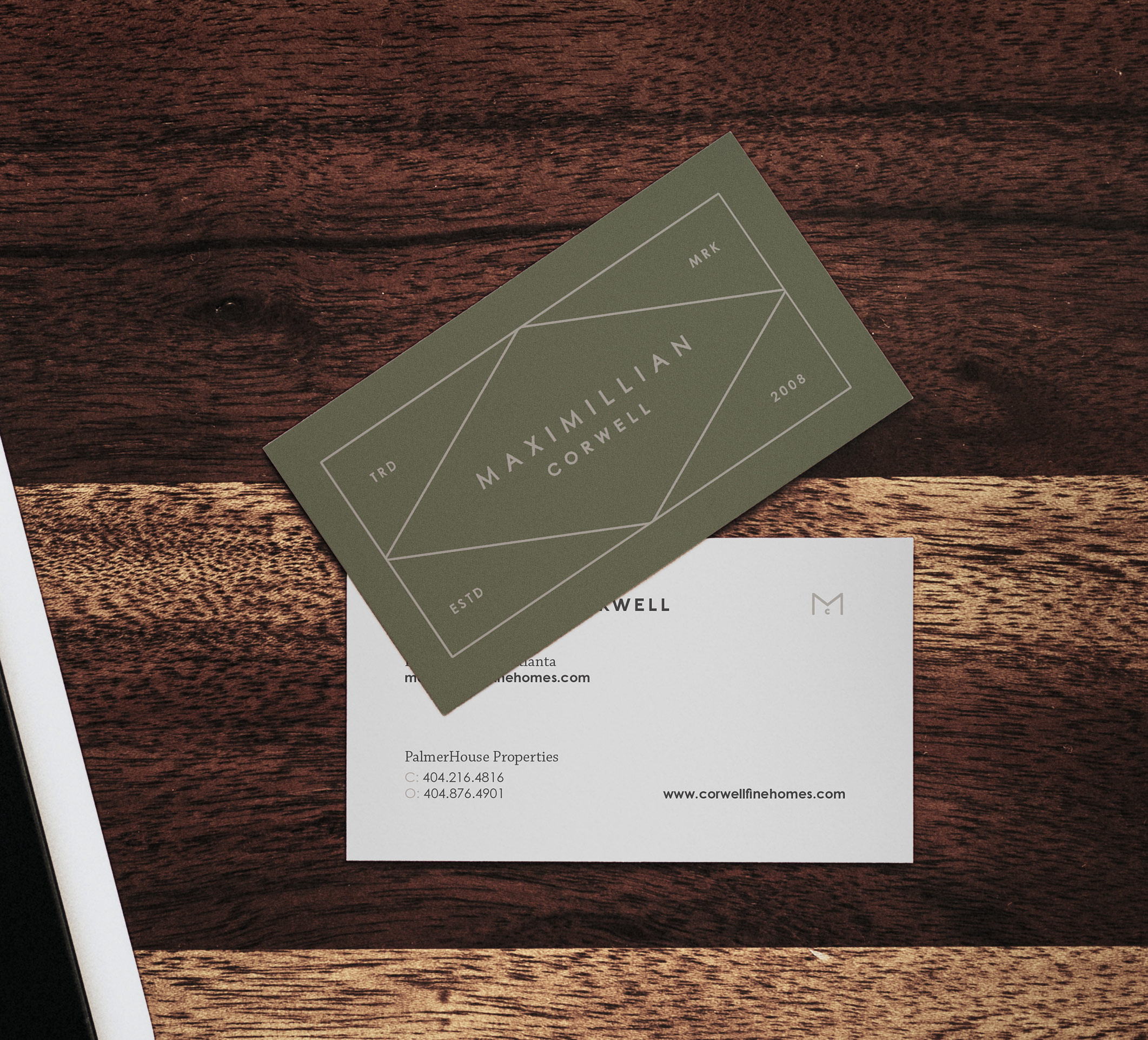
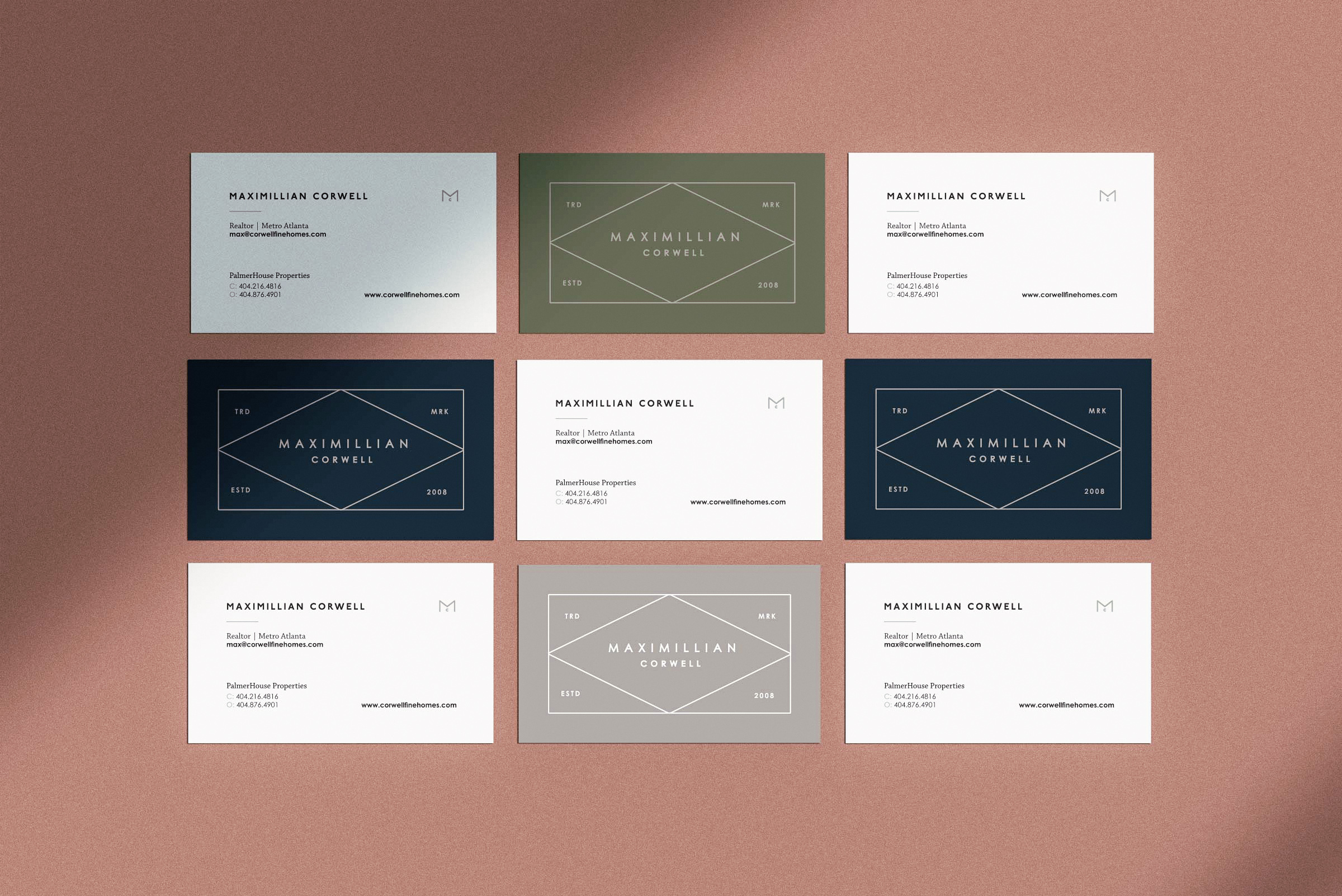
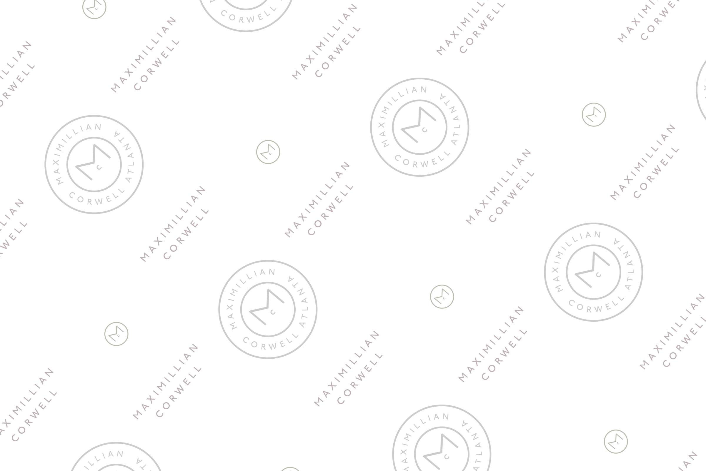
From there we worked on his business card, letterhead, brand guide, and style guide. We wanted to be able to use the modular pattern of the abstract M in a few of his pieces, which ended up being used for all of his signage.
His business card used a custom formation of the logo within the diamond shape that fit along nicely with patterns. The style guide was composed of color codes, color ratios, a logo usage guide, pattern guide and examples of how to use them all together. You can flip through a few pages below.
Conclusion
I think the main take away from Max’s brand package was that it was something new that could be appreciated from a young and old audience. We used colors that were not trendy, but also not old fashioned, something fresh for the real estate market. That paired with the clean mark and pattern to show creative tailor-made to his individual style.
Are you in the real estate industry and looking for a rebrand? I’d love to see how I can help your brand reach it’s full potential. Fill out the form below or just email me at kevin@kevincraft.co