Soul Sucker Plant Shop
Brand Identity
Author
Kevin Craft
Services
Art Direction
Logo Design
Cultivating a Brand – Soul Sucker Plant Shop
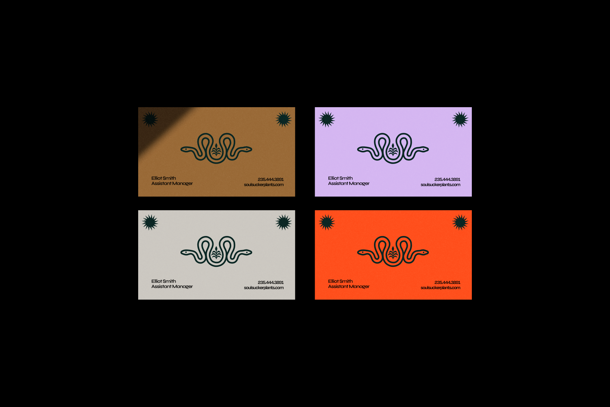
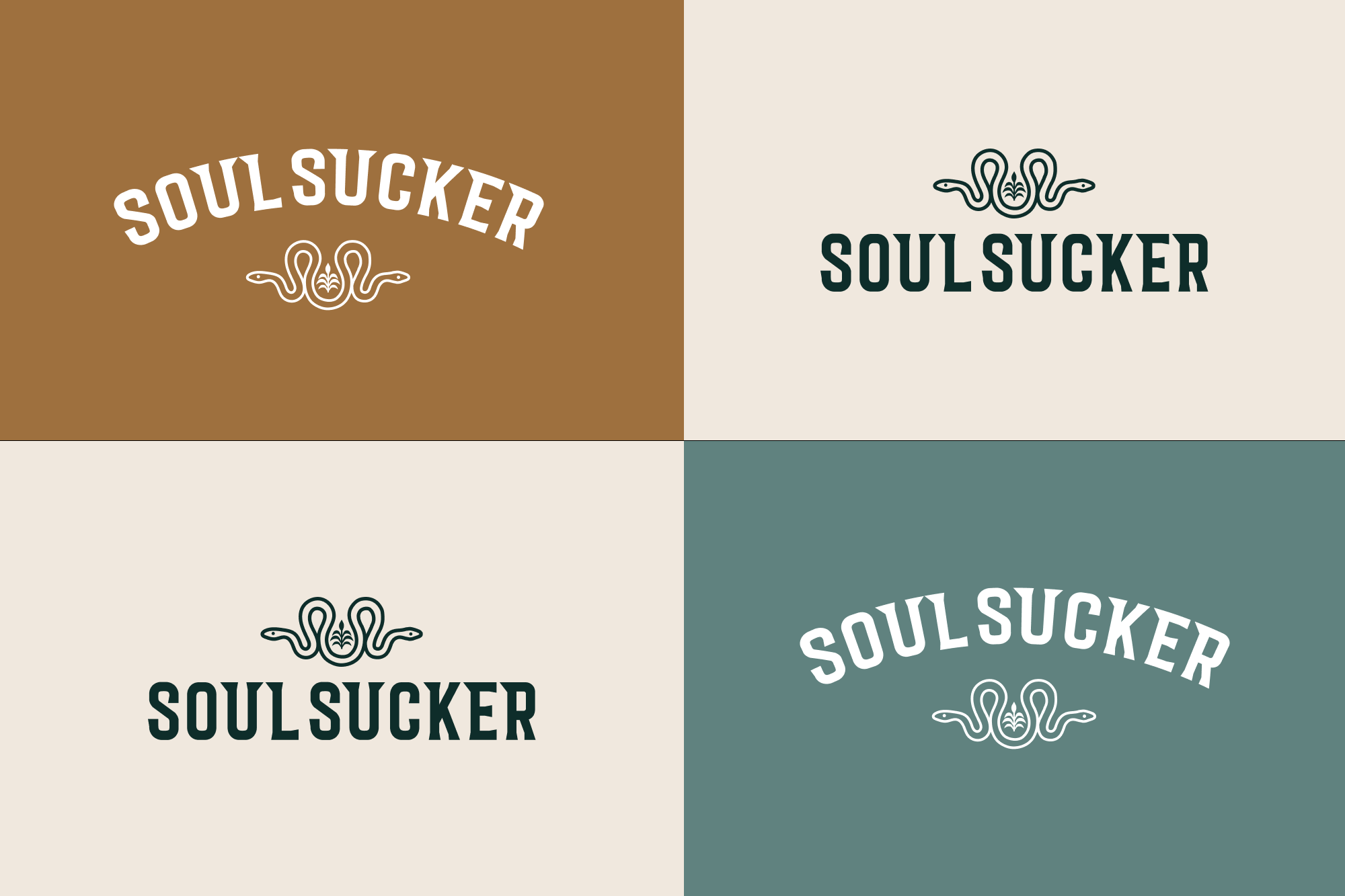
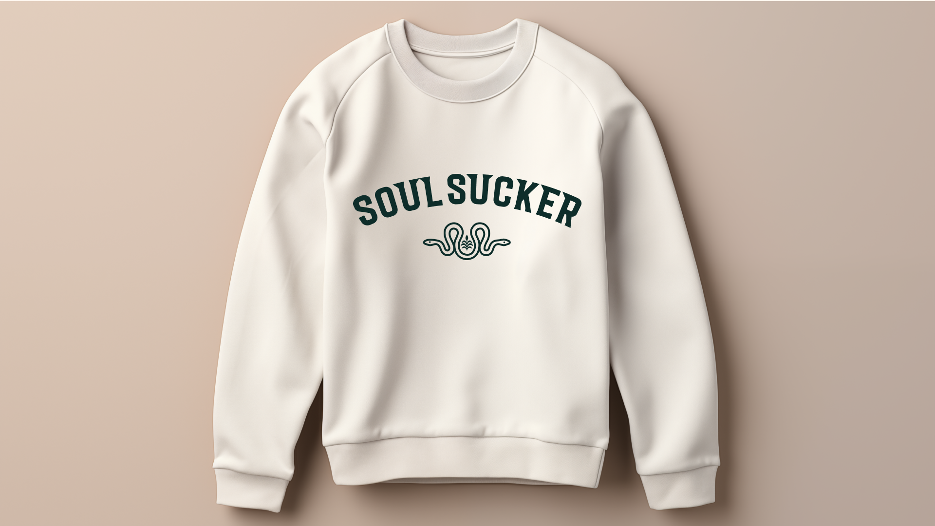
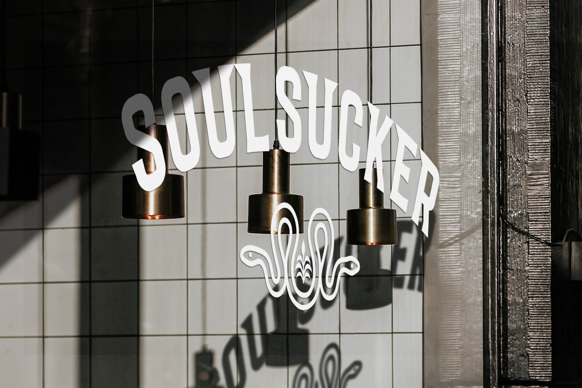
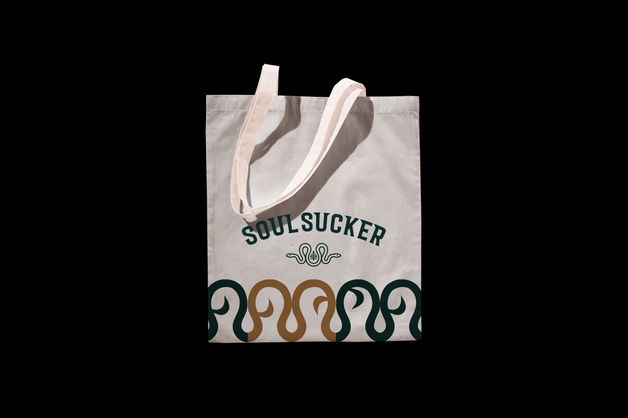
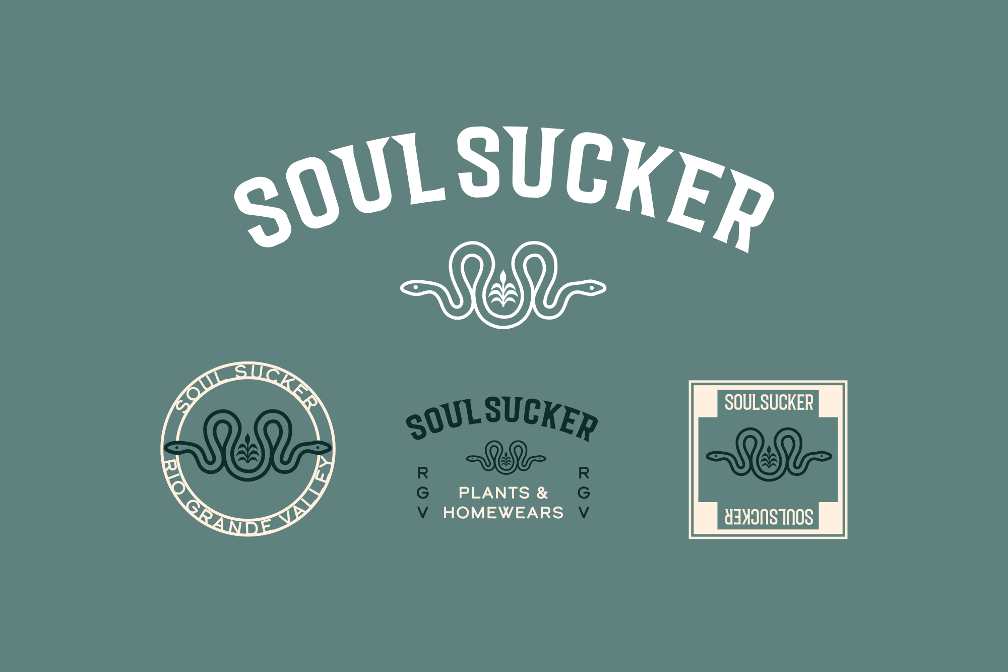
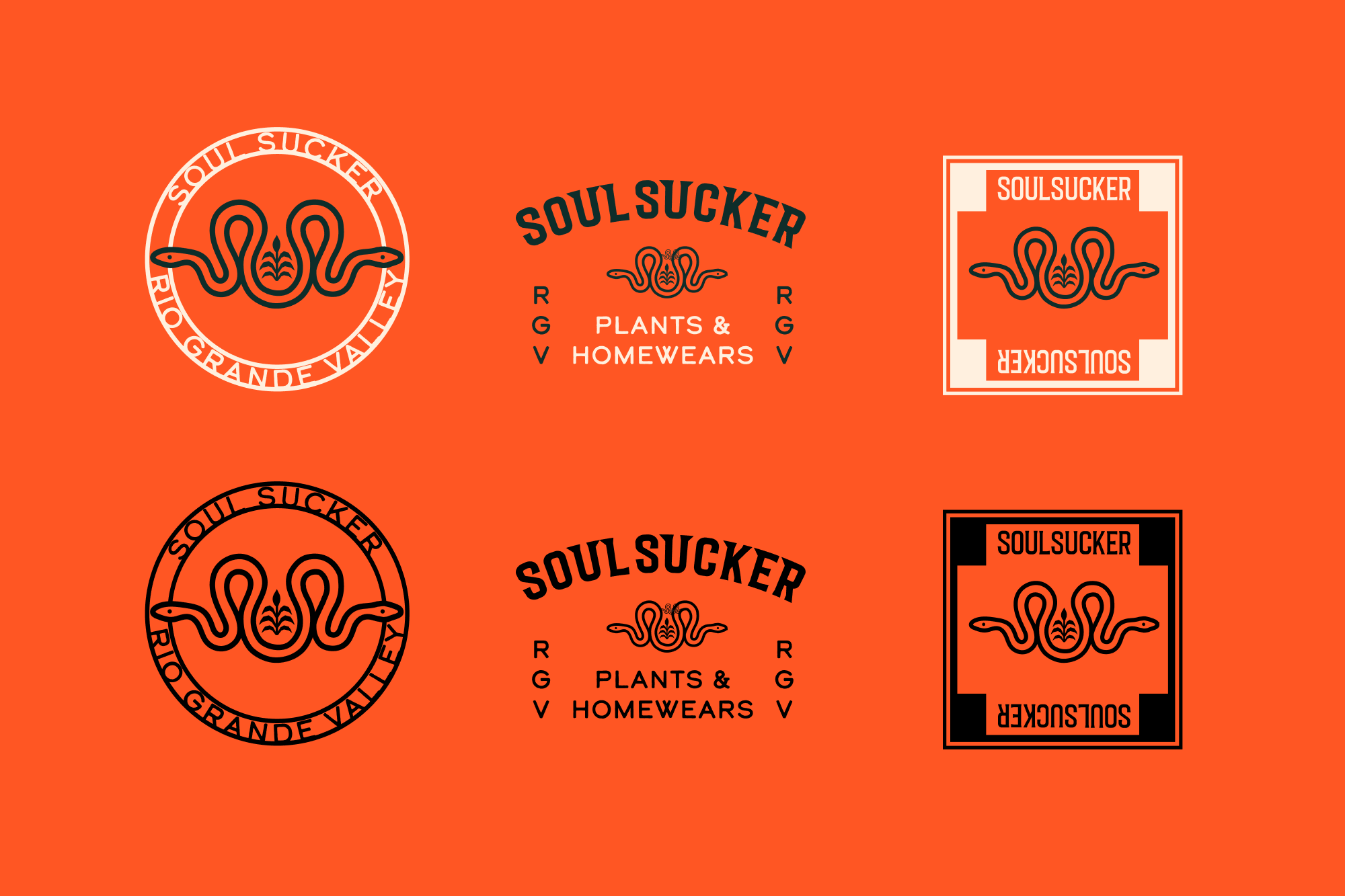
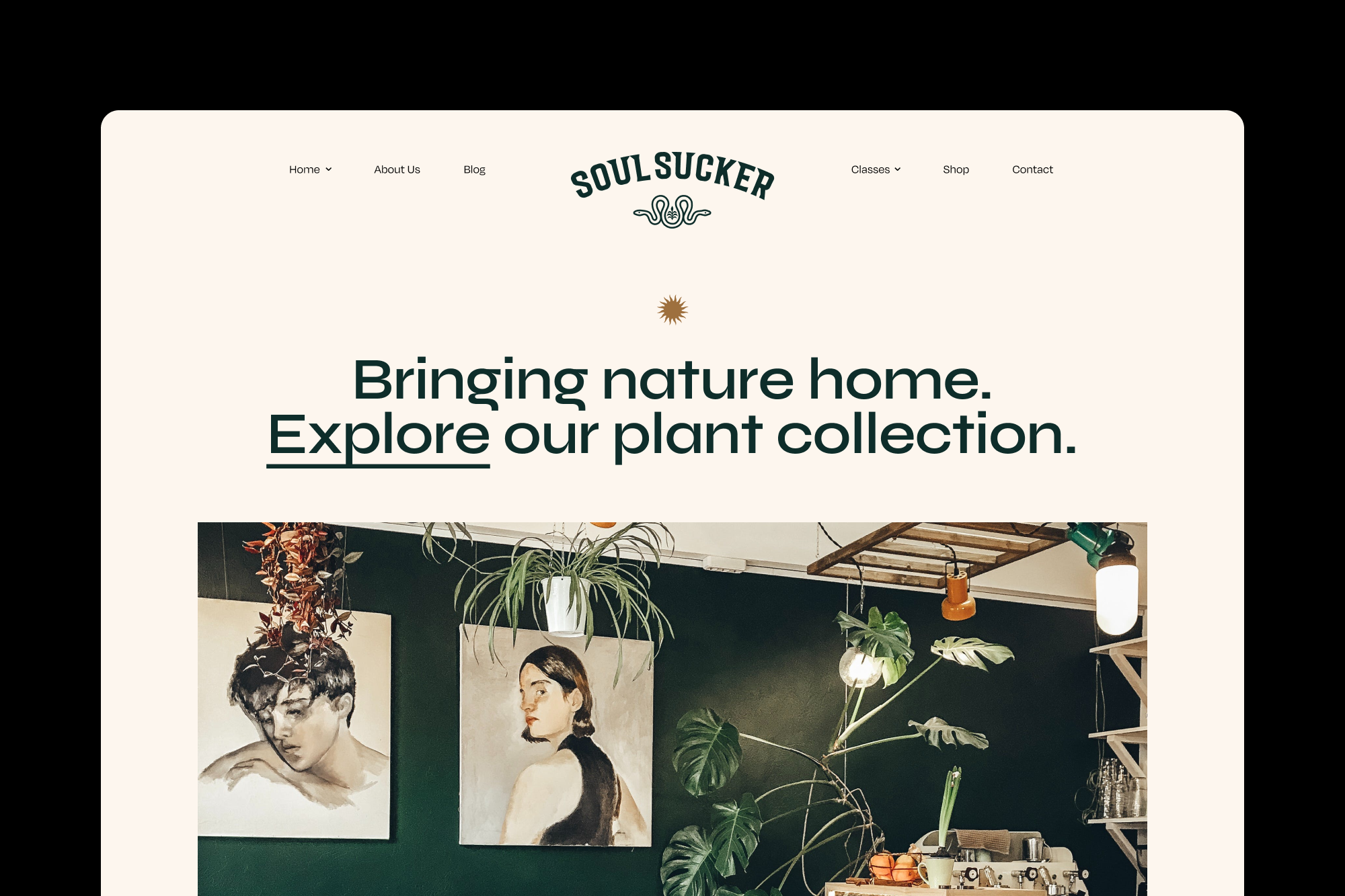
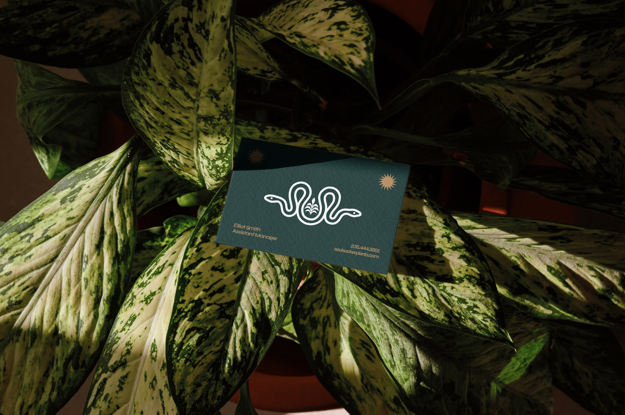
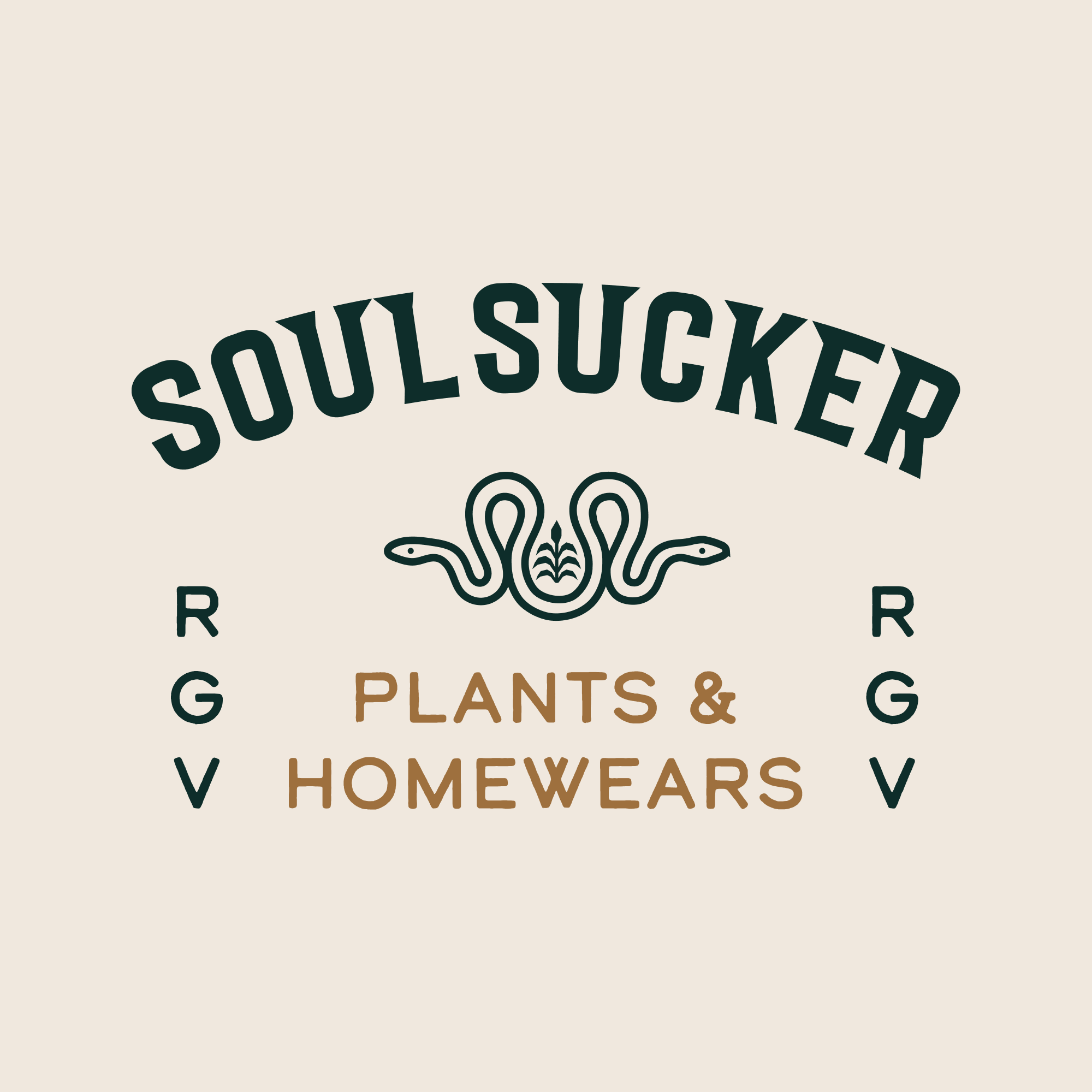
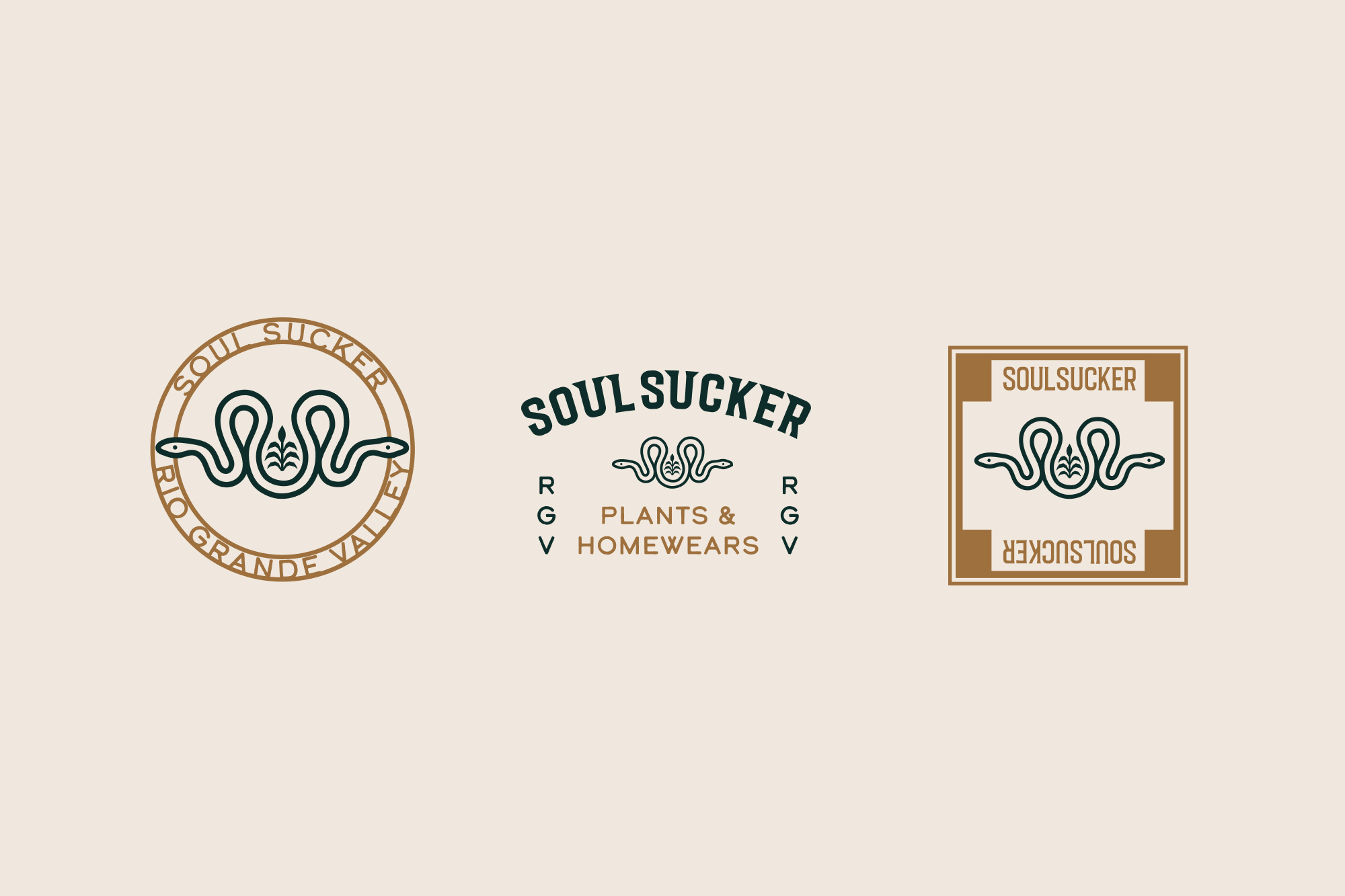
The Soul Sucker logo was meticulously crafted to embody the graceful elegance of snakes, capturing their rebellious spirit while symbolizing transformation and balance through the sleek symmetry of the ‘S’. This design choice was intentional, resonating with a rough, earthy, or artisanal aesthetic, thereby reflecting the organic essence of the indoor plant space. By merging two snakes into one, symbolizing transformation and renewal, the logo encapsulates the brand’s commitment to rebirth and growth. At its core lies a peace lily plant, emblematic of tranquility and renewal, reinforcing Soul Sucker’s dedication to promoting inner peace and well-being through its products.
Typography:
Soul Sucker’s typography exudes rebellion, challenging norms with its distinctive and unconventional typeface. This unique design choice sets the brand apart, capturing attention in a crowded market while reflecting its commitment to authenticity and individuality. The headlines, sleek and contemporary in appearance, are designed to captivate the audience while maintaining excellent legibility and ease of use, ensuring versatility and effectiveness across various platforms and media.
Color Scheme:
Drawing inspiration from nature, the color palette of Soul Sucker evokes earthly hues synonymous with plant shops, while incorporating unexpected, eye-catching colors for added vibrancy. These colors symbolize renewal and growth, capturing the essence of the brand’s transformative spaces. The incorporation of unexpected hues adds a touch of intrigue and allure to the brand’s visual identity, setting it apart in a competitive market.
Brand Patterns:
The brand pattern, composed of intertwining snakes and vines, creates an iconic texture that further reinforces Soul Sucker’s identity. This unique pattern not only adds visual interest but also serves as a memorable and distinctive element across various brand touchpoints. By weaving together elements of nature with the rebellious spirit of the snakes, the pattern reflects the brand’s commitment to authenticity, individuality, and transformative experiences.
Through the seamless integration of logo design, color scheme, brand patterns, and typography, Soul Sucker has successfully revitalized its brand identity, establishing itself as a botanical haven that embodies the essence of transformation, renewal, and connection with nature.