Tribe Film
Brand Identity / Web Design
Author
Kevin Craft
Services
Art Direction / Brand Identity / Business Card / Web Design
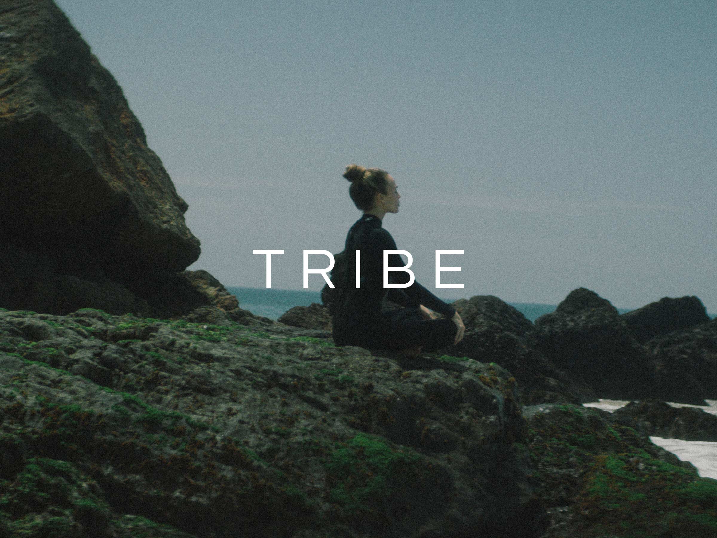
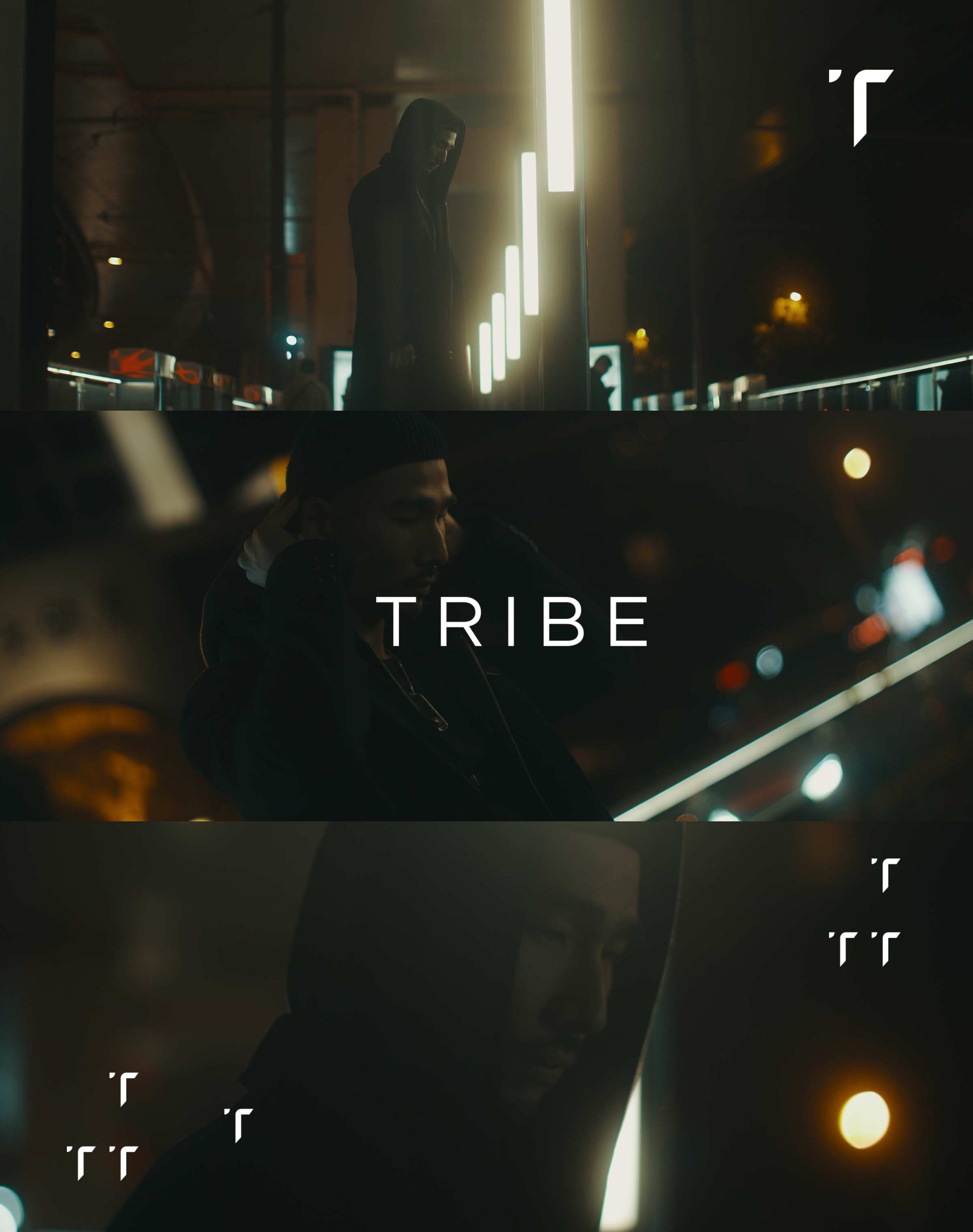
I was so excited to work with the film company, Tribe Films. We had been talking about working together for quite sometimes, so when I finally got designing I had a few ideas ready to go. I knew I wanted to do something minimal, that would showcase their stunning films and photography, and I knew it had to be a mark that could stand on its own without a logotype.
Brand
The inspiration behind the Tribe T as the mark came from the exquisite shadow work they used in their films. It really stood out to me that they are experts on lighting / shadows. I created a shadow out of the negative space of the T so when viewed on black it would look as thought it is lit in an interesting way.
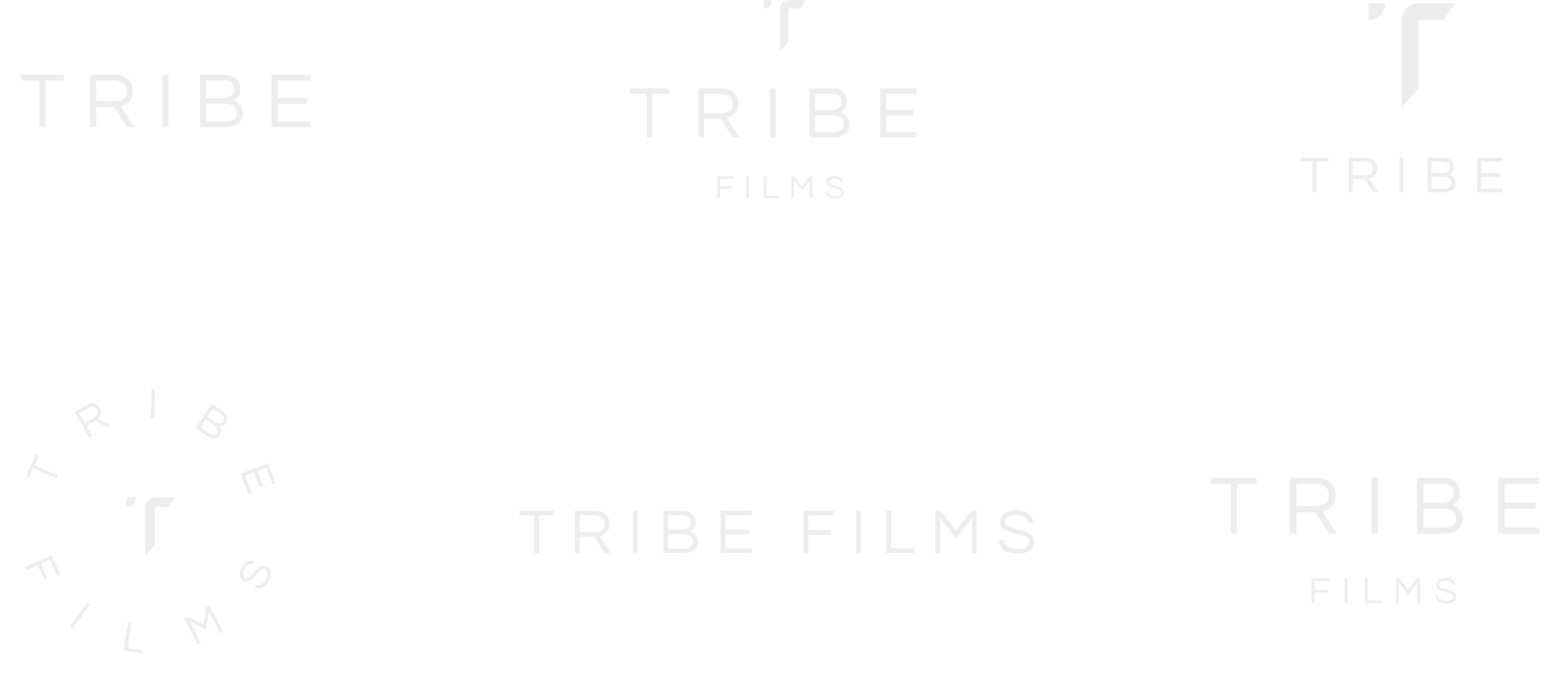


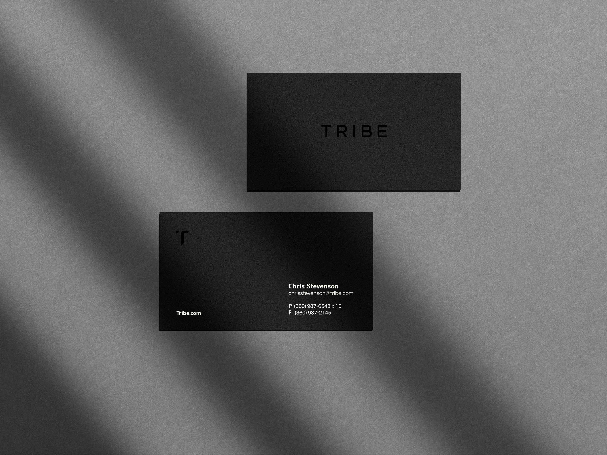
The logo symbol is integrated in different forms, stacked, horizontal as Tribe told me they had many other ventures in mind for the future of their company. The mark can easily live on it’s own, or accompanied by the type.
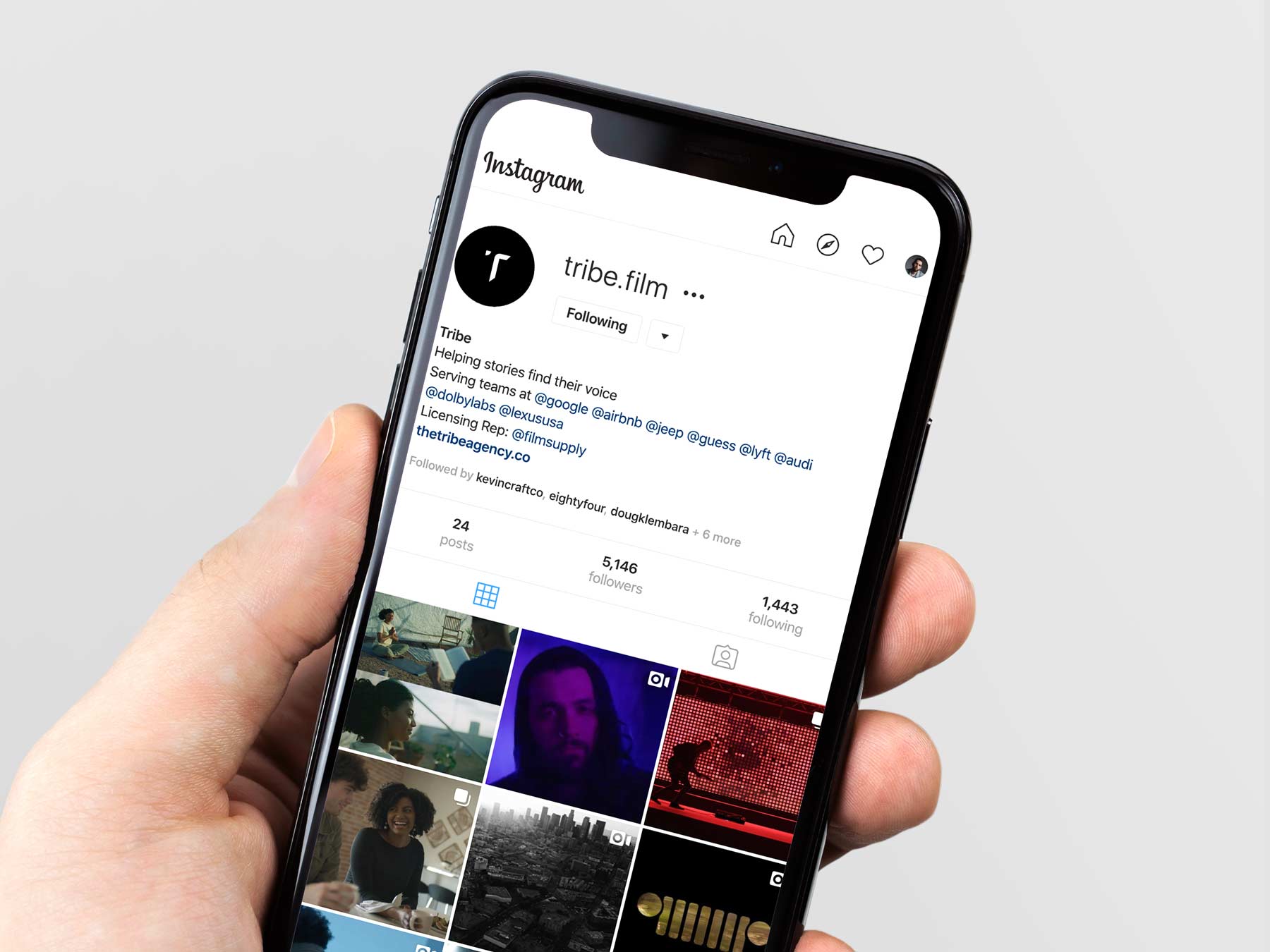
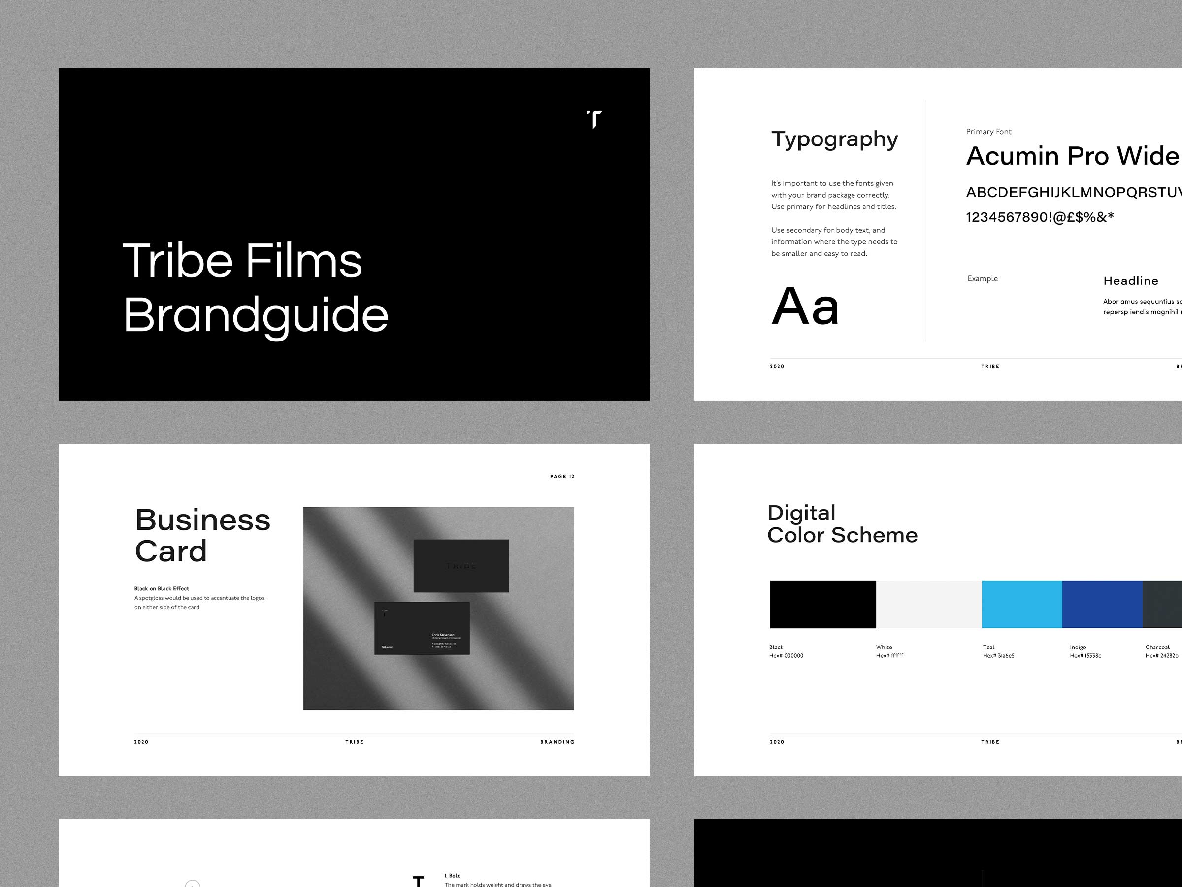
Simply doing black and white wasn’t enough for this brand. They need an extra color added to the palette to stand out from their competitors. It’s also useful for digital marketing such as buttons on their website, or social posts. An electric blue, and an indigo were added to create that distinction.
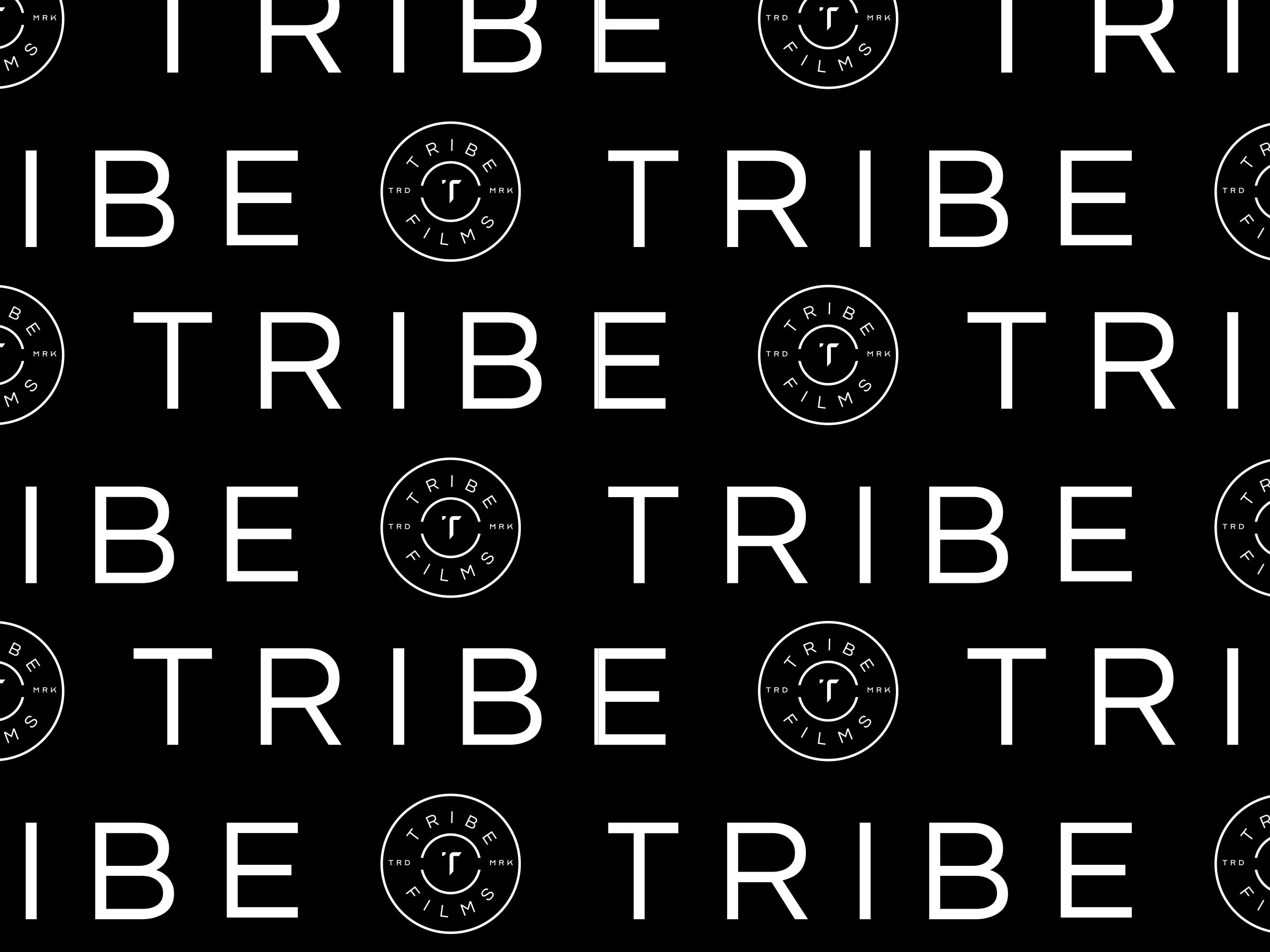
A pattern out of the badge version of the logo as well as the type was used alongside the brand. I thought the stark black and white of the typography stood well on its own as a repeating brand element.