Here’s What I Learned Working on the Boostcamp Fitness App Brand Identity
Boostcamp is a fit tech app built for lifters, people who want structured, trainer-designed programs and real progress tracking, not just another generic workout app. As a tech-driven fitness brand, the identity needed to feel just as sharp and precise as the product itself.
The challenge
Fitness app brands often fall into one of two traps: either they lean so hard into “tech” that they lose any sense of energy or motivation, or they lean so hard into fitness that they end up looking like a gym poster instead of a piece of software. Boostcamp needed both at once, something that felt performance-driven and motivational, but also clean, modern, and functional enough to live comfortably inside an app interface.
The approach
Everything centers on growth, strength, and progress. The logo mark is a dynamic, lowercase “b,” built to symbolize building and becoming stronger over time, paired with a clean, contemporary sans-serif wordmark. I kept the overall approach minimalist on purpose, since a tech-driven fitness brand needs to feel timeless and functional first, expressive second.
For color, I used black, white, and a gold yellow accent, a palette meant to balance power, clarity, and achievement. The black and white create a strong, clean foundation, while the gold yellow acts as a motivational highlight tied to triumph and vitality. Supporting patterns throughout the system use bold, angular shapes and grid-like structures, a visual echo of both building muscle and the precision of fitness-tracking data, so the pattern language does double duty tying together the physical and digital sides of the brand.
What I learned
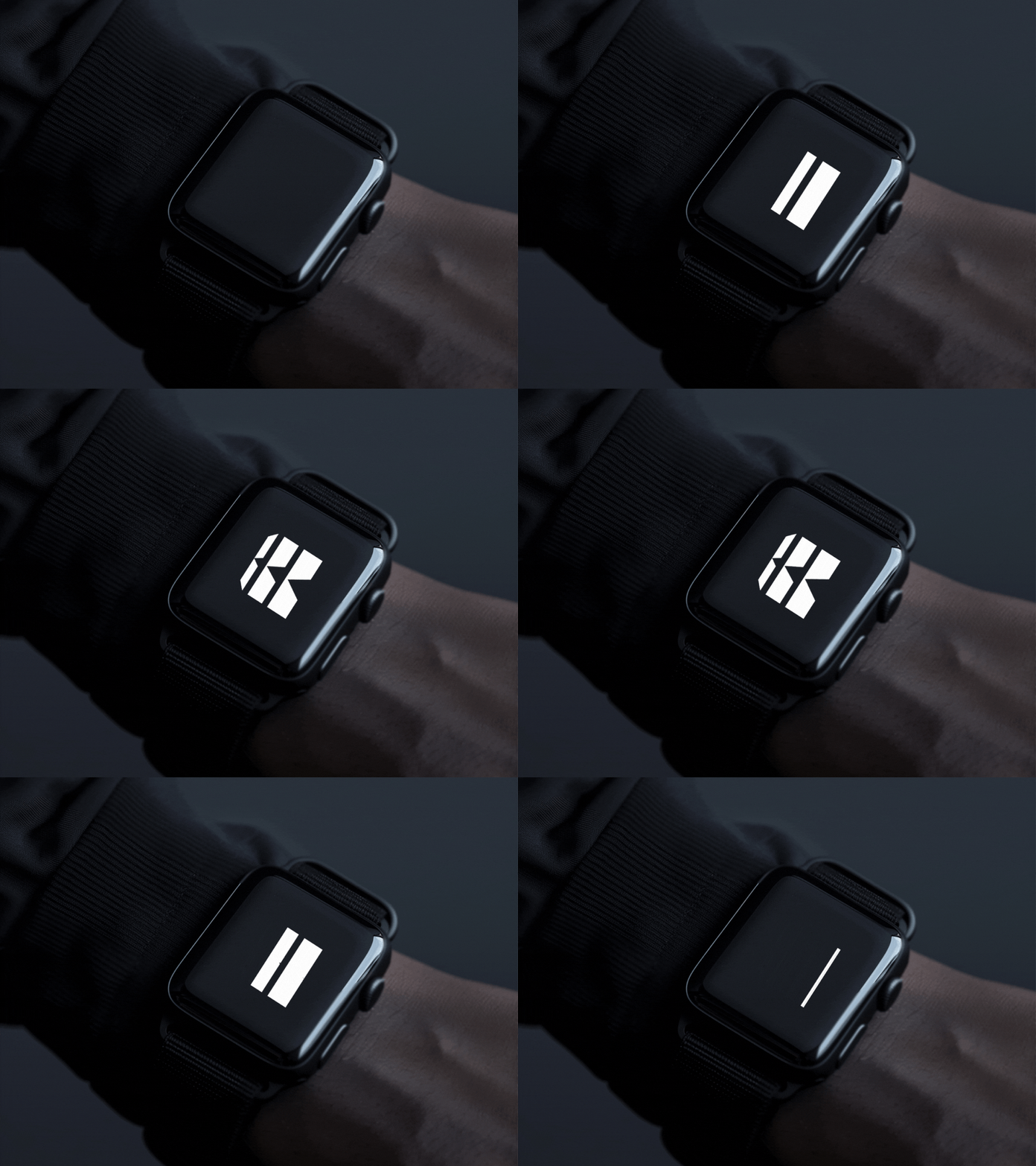
Boostcamp reinforced how much restraint matters when a brand has to perform across both physical and digital touchpoints. A logo and pattern system built for marketing materials doesn’t always hold up cleanly inside an app interface, and vice versa. Keeping the mark simple, the palette limited, and the pattern language geometric meant the identity could scale down into UI elements just as easily as it could scale up into bold marketing visuals, without ever needing a separate “digital version” of the brand.
If you’re building a brand that has to live in an app as much as it lives in marketing, it’s worth asking early: does this system still hold up at icon size, or does it only work as a big, standalone graphic?