Here’s What I Learned Working on the Evolv Chiropractic Brand
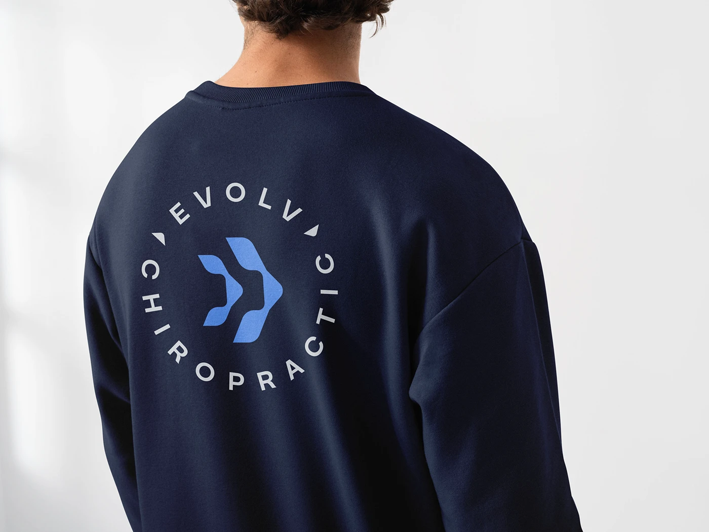
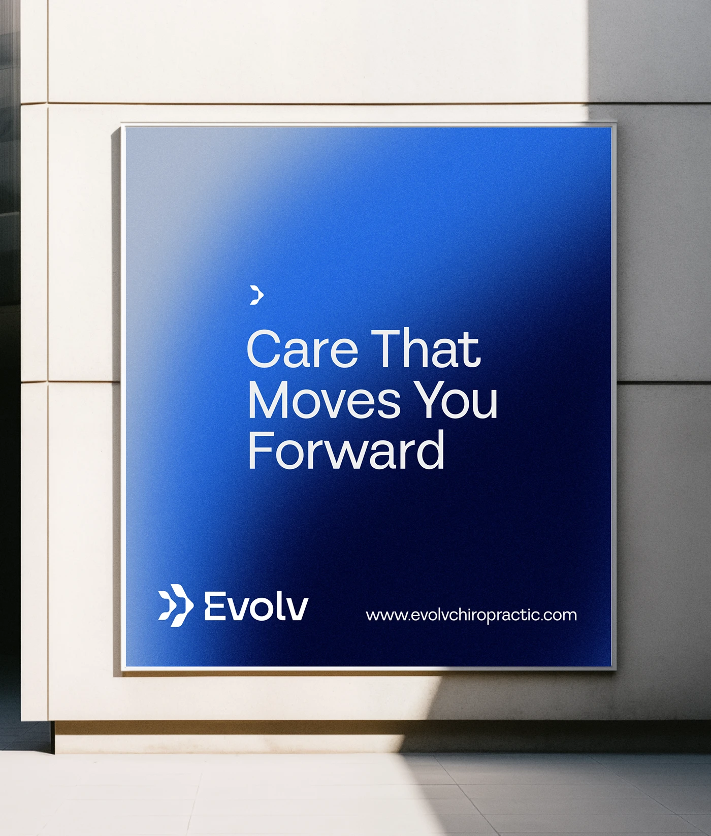
Evolv Chiropractic is a Dallas-based practice that needed a visual identity as dynamic as the care they provide. They weren’t looking for a typical clinical brand, they wanted something that felt bold and modern, something that reflected movement, progress, and a forward-thinking approach to spinal health.
The challenge
Healthcare brands, chiropractic especially, tend to default to clinical and sterile: cool blues, sans-serif type, stock photos of spines. That approach can feel safe, but it rarely feels memorable. Evolv wanted to stand apart in a crowded healthcare space without losing the trust and professionalism patients expect from a practice they’re handing their body over to.
The approach
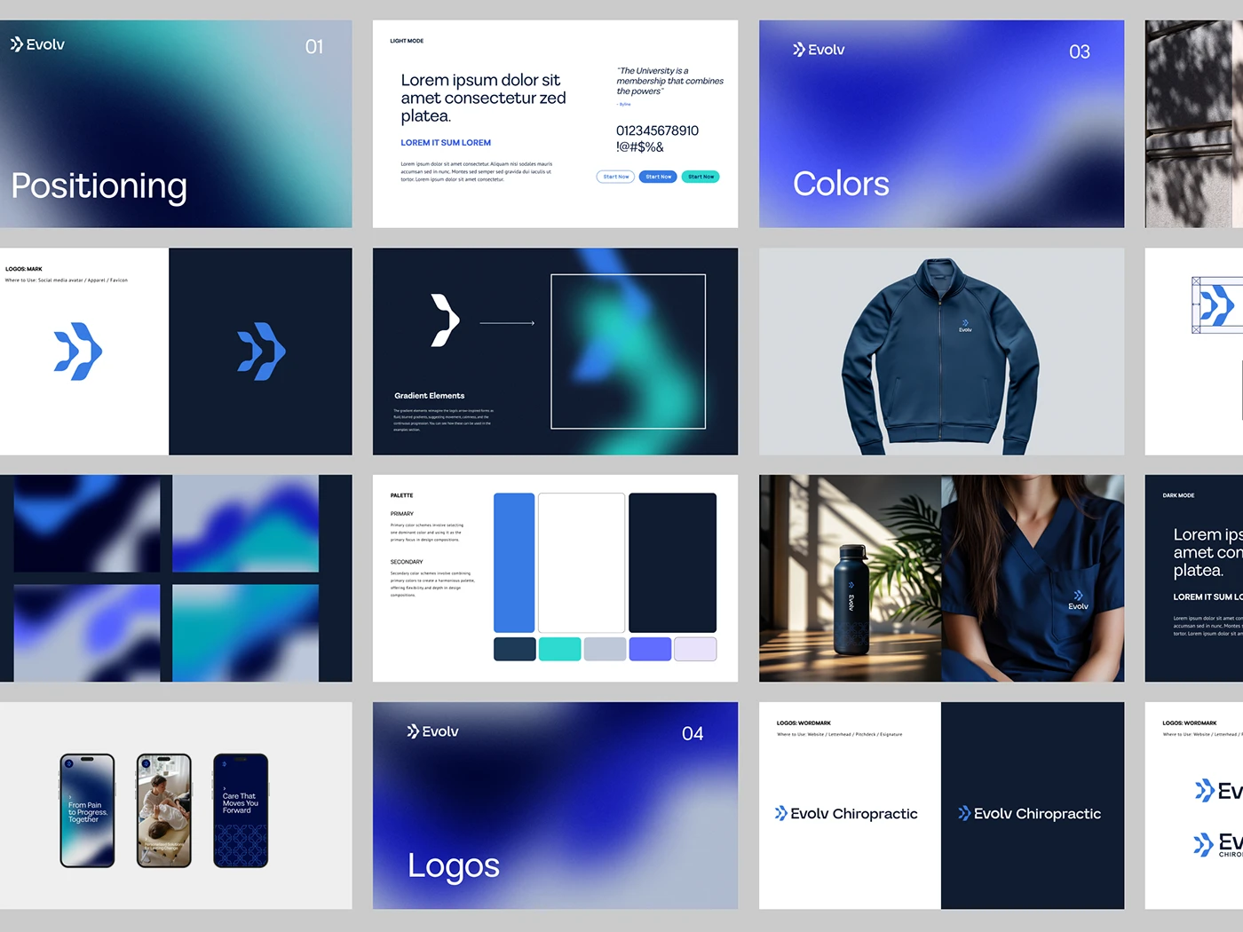
I built the identity around the idea of motion and alignment, drawing directly from the natural curvature of the spine. That became the visual thread running through the whole system: balance and progression, structure and movement, held together.
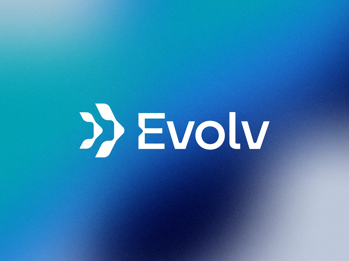
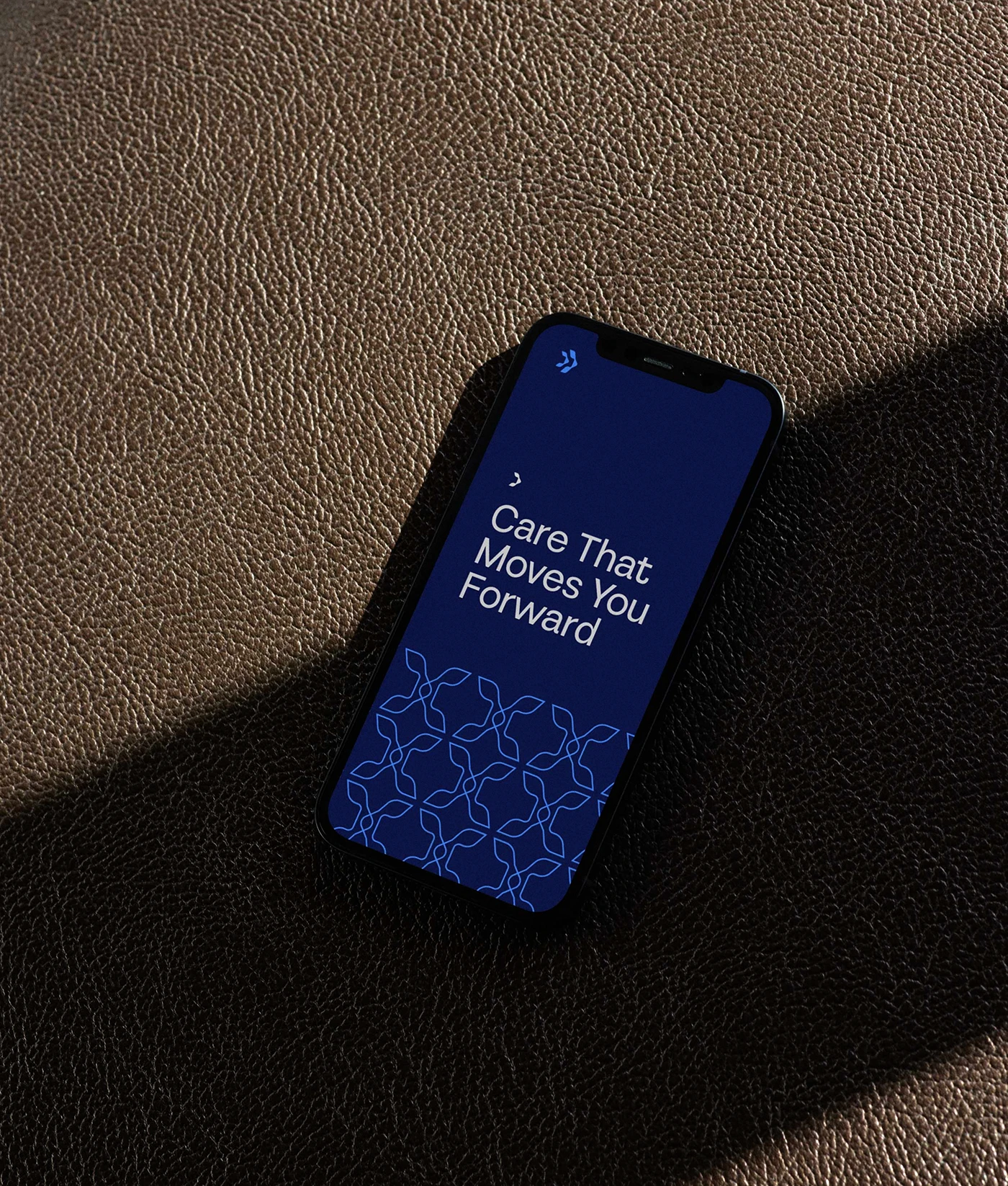
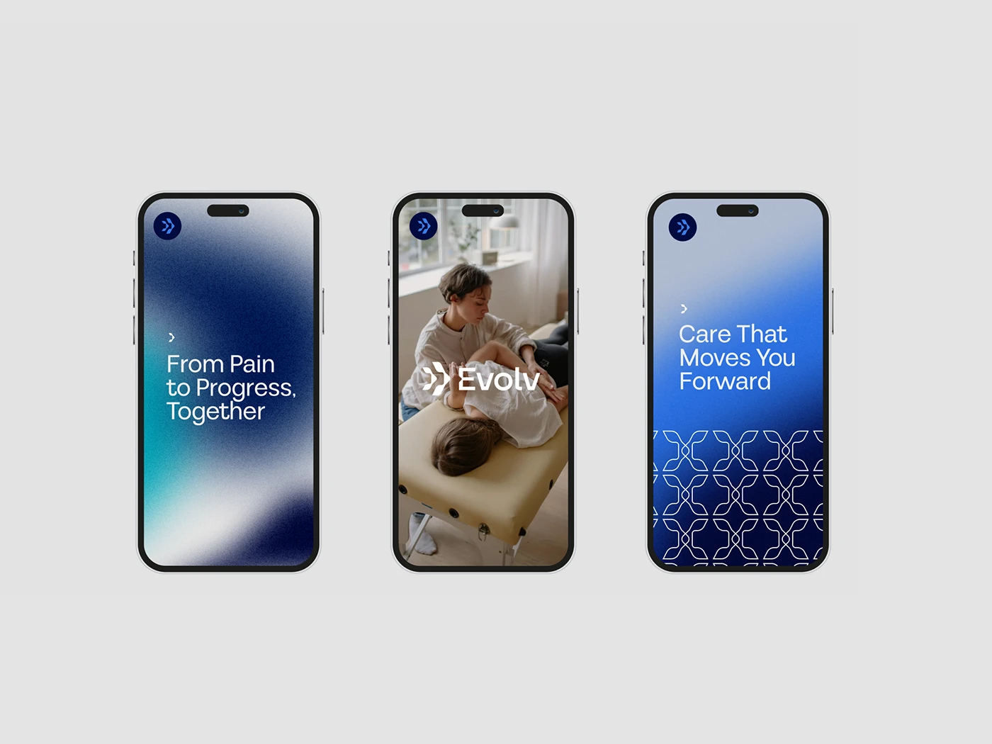
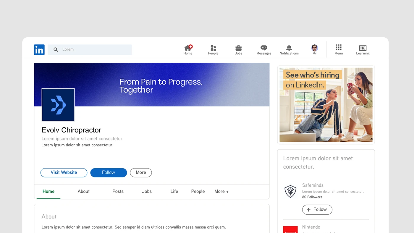
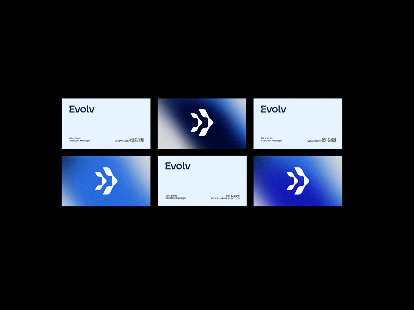
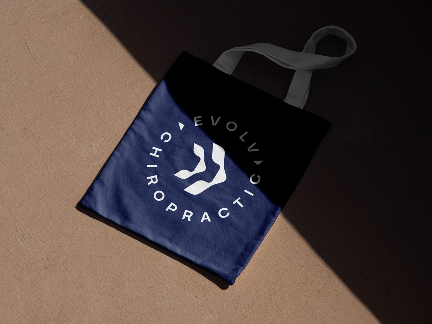
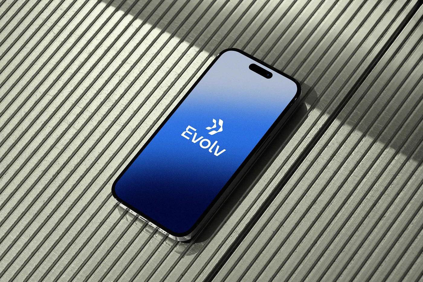
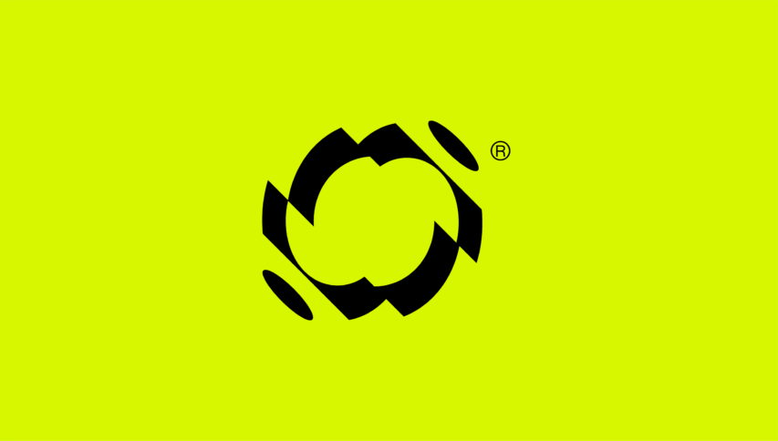
The mark itself is an abstract symbol derived from vertebrae, with a forward-moving arrow built into the design to represent growth and progressive care. For color, I used cool, calming tones contrasted against energetic gradients, a way of visually expressing the harmony between structure and movement that’s central to what Evolv actually does. Bold typography and vertebrae-inspired patterns reinforced the practice’s focus on spinal health and continuous improvement throughout the rest of the system.
What I learned
This project reinforced something I come back to often: the best metaphor for a brand is usually hiding inside what the client already does, not something borrowed from outside it. Evolv didn’t need an abstract idea imported from somewhere else. The spine itself, its curvature, its structure, its capacity for alignment and progress, was already the perfect visual language. The job was just translating it.
If you’re building a brand in a field that feels overly clinical or generic by default, it’s worth asking: what does the actual practice, product, or process look like, physically or conceptually? That’s usually where the real identity is hiding.