Here’s What I Learned Working on the Oxygen Fitness Brand

Oxygen Fitness is a forward-thinking fitness brand built to empower people through tailored strength programs. Before a single design decision got made, we spent time in strategy workshops defining what the brand actually needed to say, and to whom.
The challenge
Fitness brands can lean heavily on two extremes: aggressive, gritty gym aesthetics, or soft, generic wellness visuals. Oxygen Fitness didn’t fit neatly into either. Their audience was primarily young professionals and executives, people who wanted results and intelligence behind their training, not just intensity for its own sake. The brand needed to feel futuristic and high-performance without losing approachability.
The approach
Everything started with strategy. Through a series of workshops, we landed on four keywords that became the compass for the entire identity: strong, achiever, futuristic, intelligent. Every visual decision after that had to earn its place against those four words.
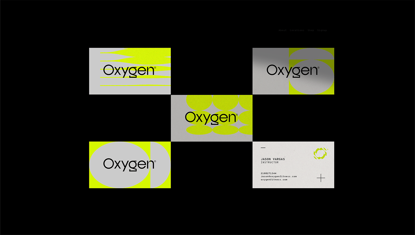
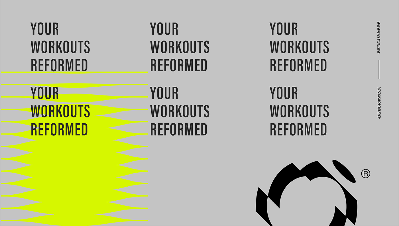
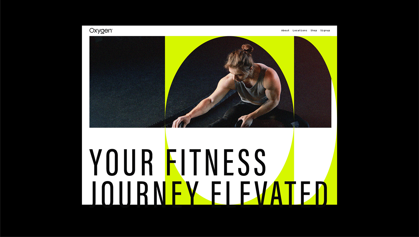
The logo mark is a transforming “O,” built to look like it’s mid-analysis, constantly evolving, which mirrors the brand’s philosophy of continuous improvement. I paired it with a stylized, bold, condensed sans-serif logotype to keep the mark feeling sharp and current. For color, I used neon yellow against cool grey, black, and white, a combination that reads as futuristic and high-end rather than the typical gym color palette. Photography leaned into warm reds in motion, adding energy and contrast against all that cool neon and grey, capturing the dynamism of the actual workouts rather than static, posed shots.
What I learned
Oxygen Fitness reinforced how much strategy work up front changes the ceiling of what a brand can become. Landing on those four keywords, strong, achiever, futuristic, intelligent, before touching a single visual gave the whole system permission to feel more ambitious and specific than a typical fitness brand. The transforming “O” mark wouldn’t have made sense without “futuristic” and “intelligent” already locked in as guiding principles.
If you’re building a brand for a fitness or performance audience that wants to feel smart, not just strong, the identity has to reflect that duality. It’s worth asking early: what four words would your ideal client use to describe how they want to feel, not just look?