Here’s What I Learned Working on the Harrow Hospitality Brand
Harrow Hospitality Group came in with a lot already figured out. The vision was clear, the operations were sharp, and the group had real ethos behind it, running boutique hotels and restaurants that people genuinely loved. What they didn’t have yet was a visual language that could carry all of that consistently, whether it showed up on a sign above a doorway, a business card, a social post, or a staff uniform.
The challenge
Hospitality brands tend to fall into one of two lanes. Either they go corporate and end up feeling generic, or they lean so hard into rustic warmth that they start to feel like every other boutique brand out there. Harrow needed to live outside both of those lanes: refined, but still alive. Something that could feel just as at home in a printed menu as it did on a hotel room key.
The approach
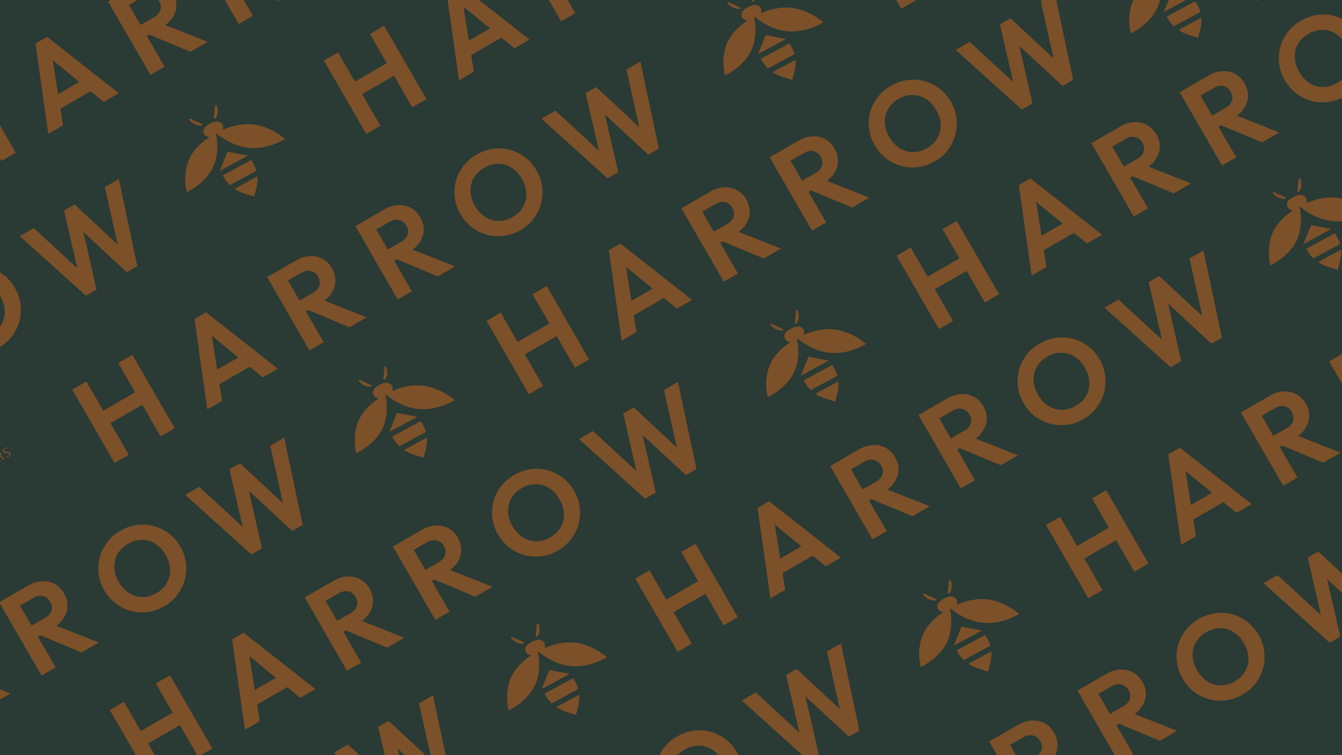
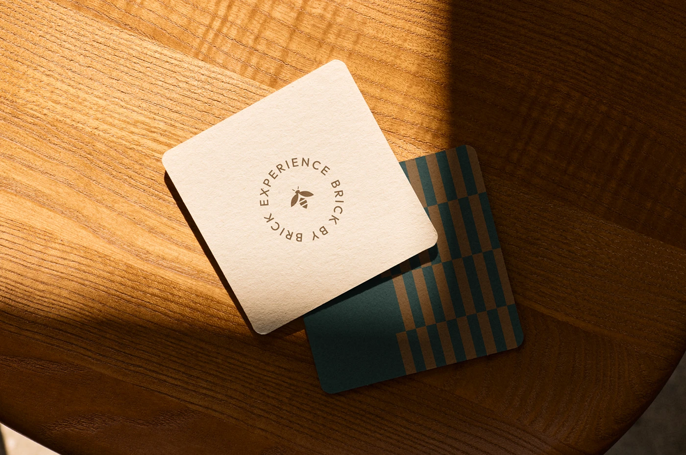
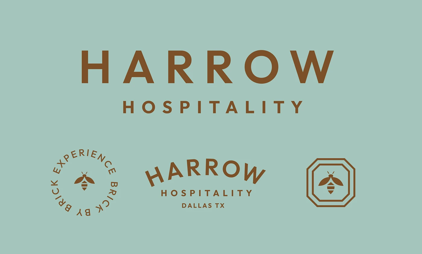
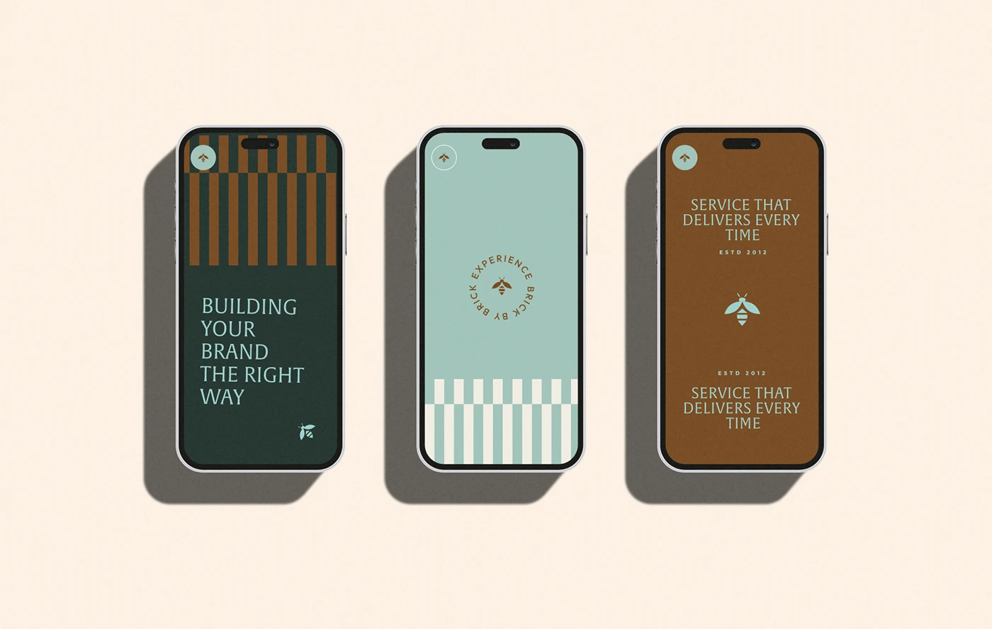
I built the identity around a single organizing idea: experience, brick by brick. Like a hive, everything in the system is made of repeating, interlocking pieces, each one deliberate, each one part of something bigger.
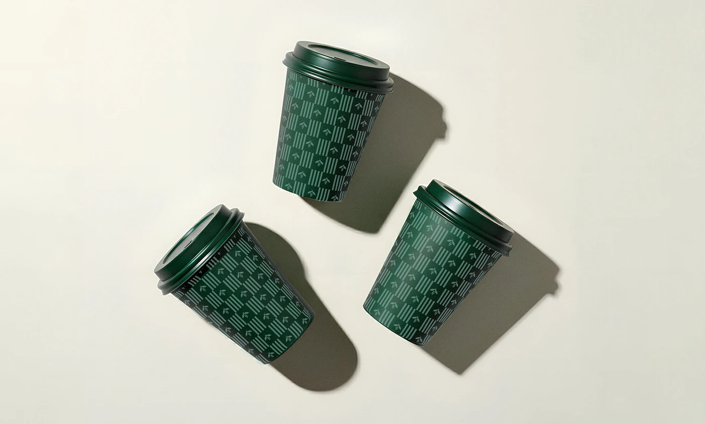
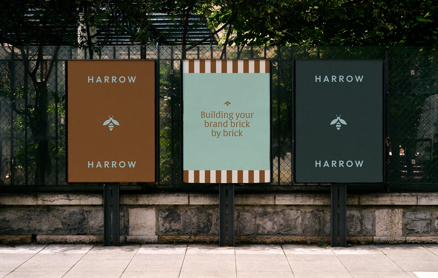
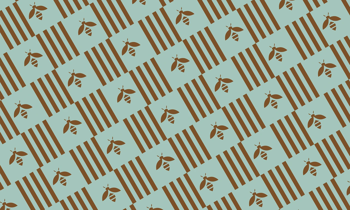
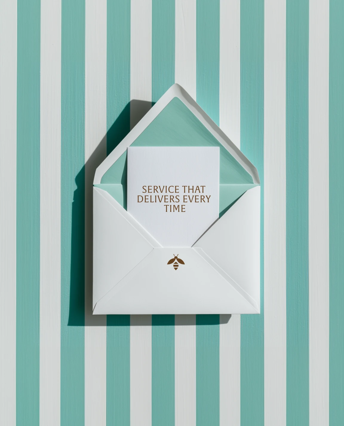
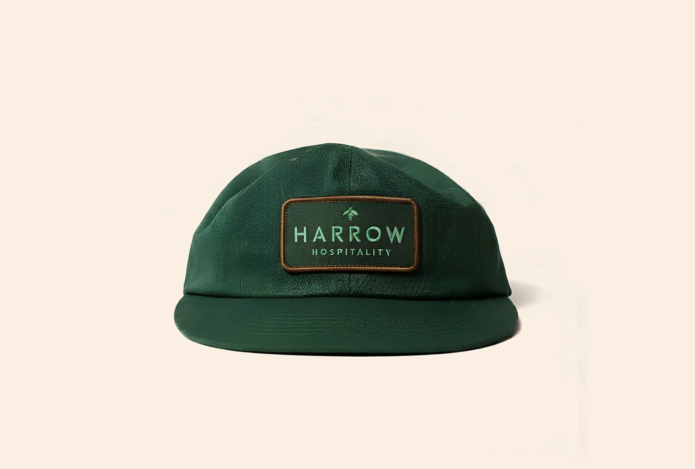
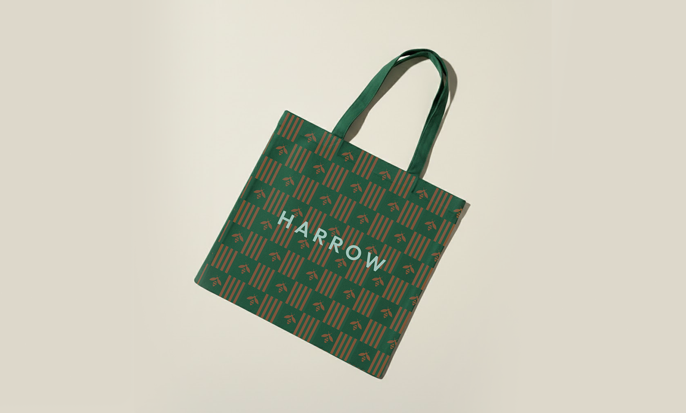
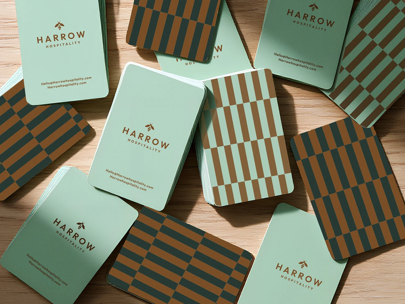
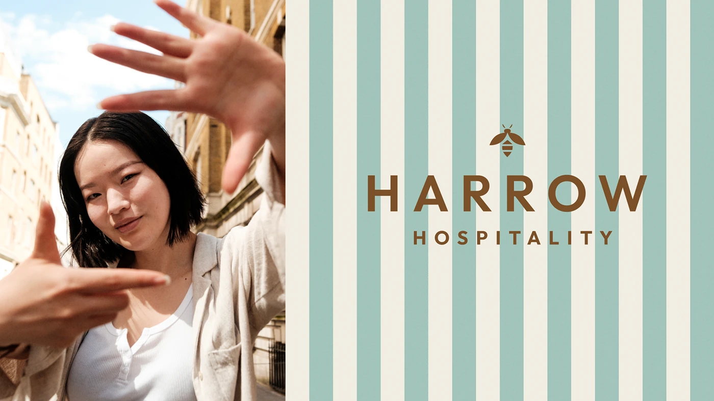
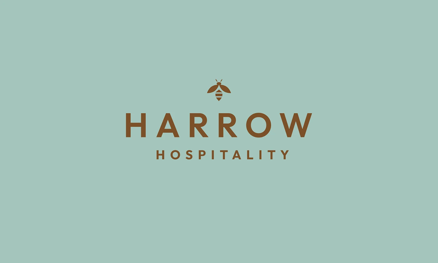
A bee mark sits at the center of both the primary wordmark and a circular seal, giving the whole system something organic and enduring to anchor to. From there, a supporting pattern system uses vertical and checkerboard stripe arrangements that reference honeycomb geometry and the literal idea of building, brick by brick. For color, I chose mint, deep green, warm cognac, and off-white, a palette that reads just as well in a boutique interior as it does in high-end print.
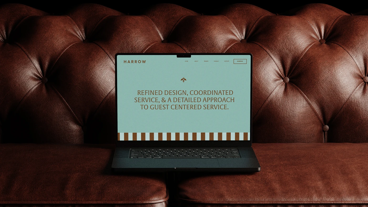
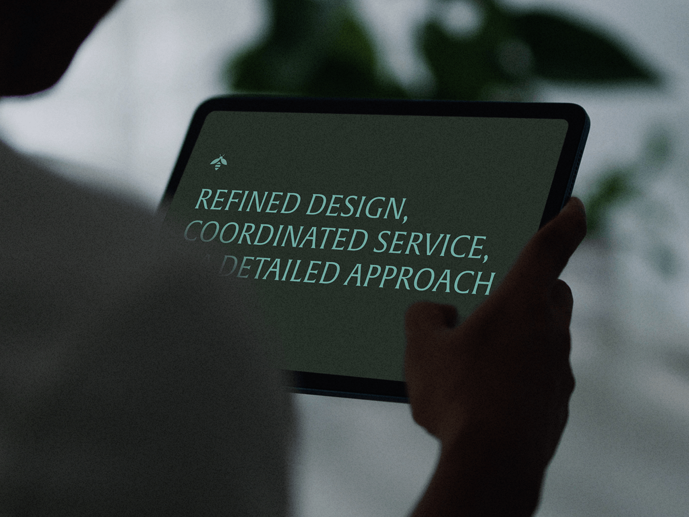
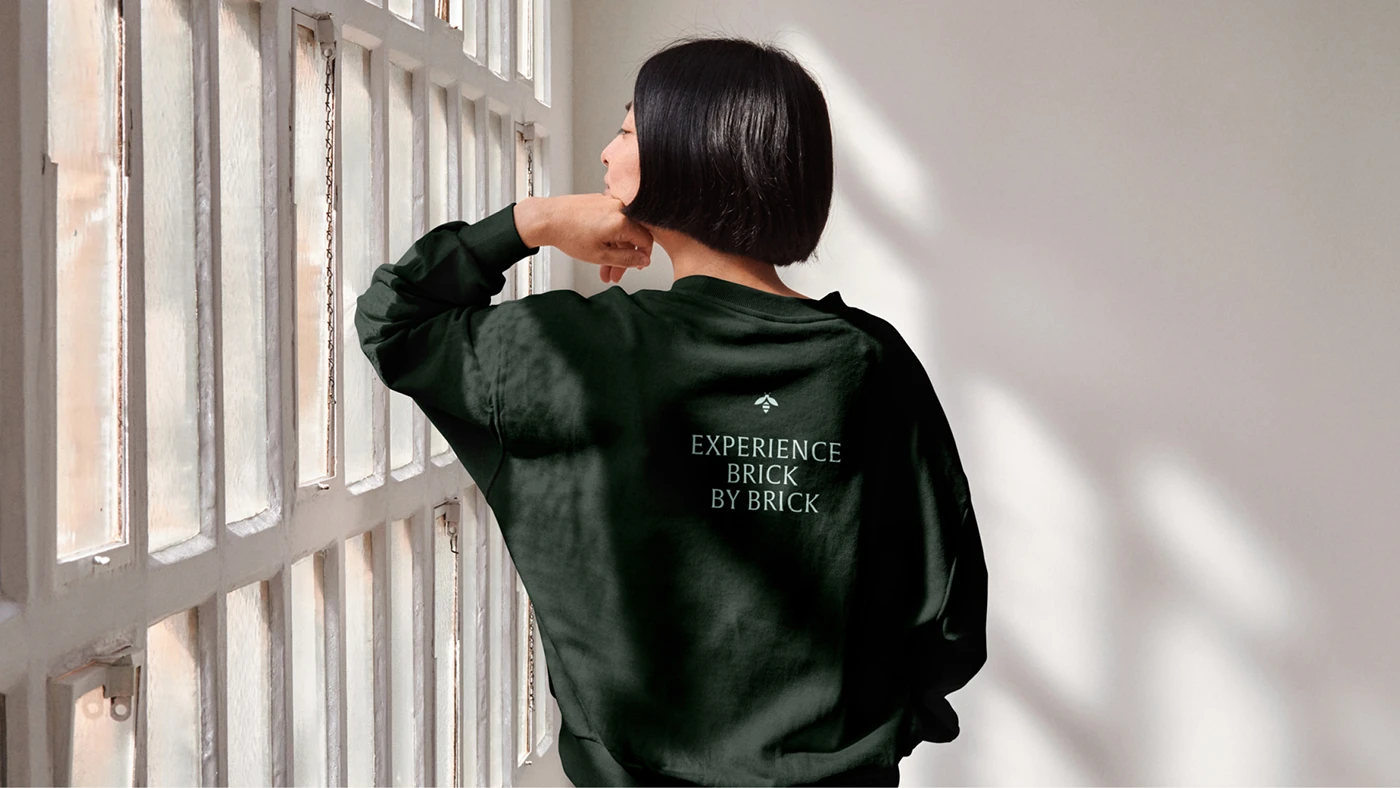
The final system covers logo, seal, business cards, apparel, signage, and digital templates, all built to work together as one structured, but alive, identity.
What I learned
The lesson from this one is about finding an idea sturdy enough to hold a lot of weight. Hospitality brands touch so many different surfaces and moments that a system without a strong organizing concept tends to fall apart the moment it leaves the mood board. Harrow works because the hive concept isn’t decoration, it’s structural. Every pattern, every mark, every color choice ties back to the same idea: things built brick by brick, piece by piece, into something bigger.
If you’re building a brand that has to live across a lot of different touchpoints, that’s the real question to start with: what’s the one idea strong enough to hold all of it together?