Here’s What I Learned Working on the Sprezza Seltzer Brand Identity

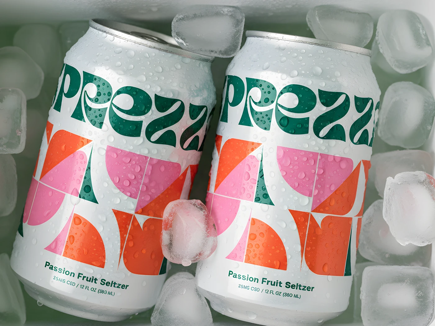
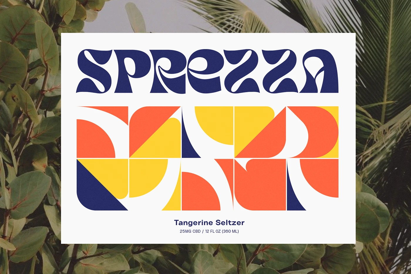
Sprezza is a CBD seltzer built to stand out in an increasingly crowded beverage aisle. Instead of leaning into the clinical, wellness-forward look a lot of CBD drinks default to, Sprezza wanted something that felt like an escape, tropical, upbeat, and a little indulgent.
The challenge
CBD beverages tend to visually split into two camps: overly clinical and sterile, or overly earthy and crunchy. Neither fit what Sprezza actually wanted to be. This is a drink meant to feel like a beach vacation in a can, so the identity needed to sell that feeling first, with the CBD functional benefit supporting it, not leading it.
The approach
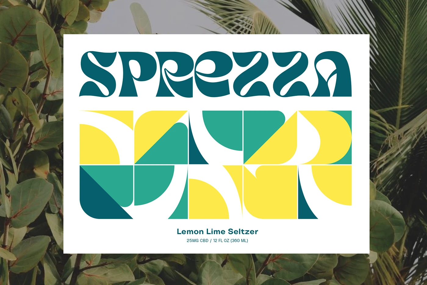
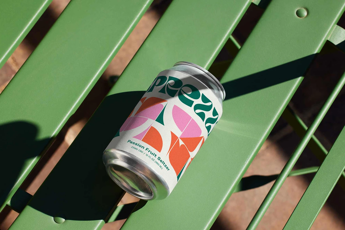
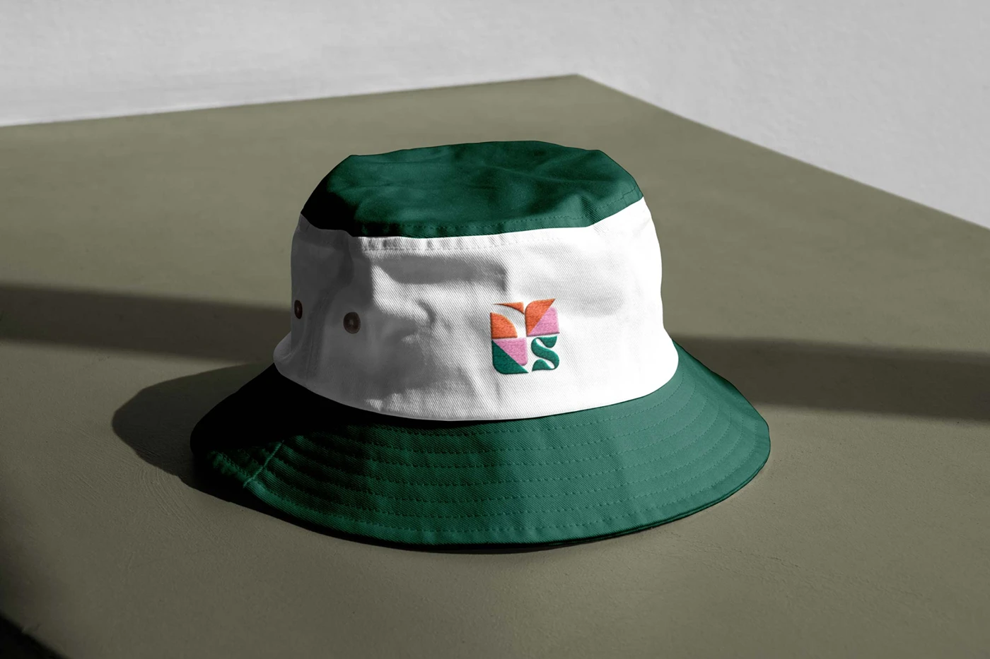
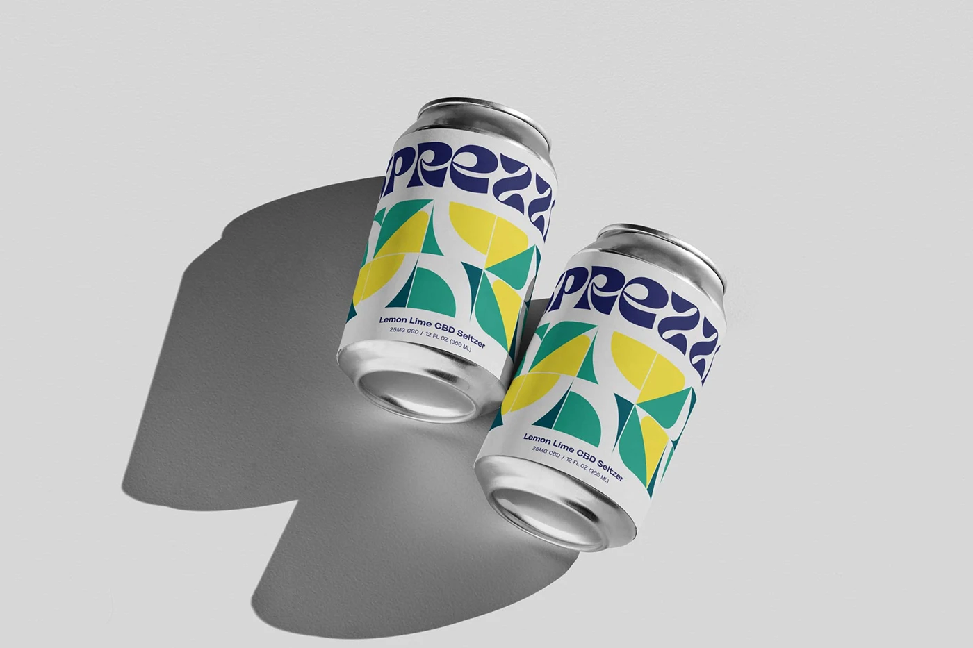
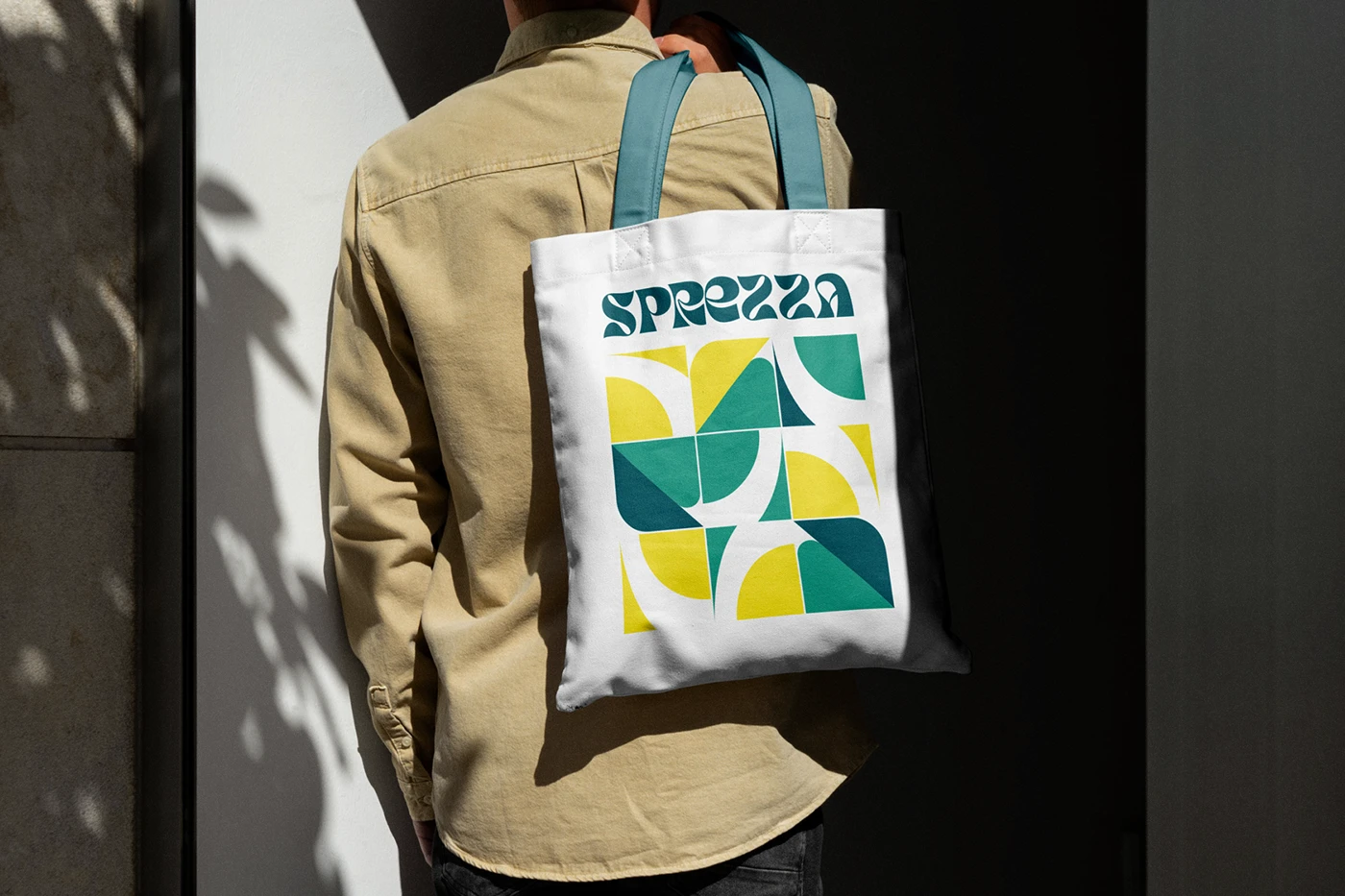
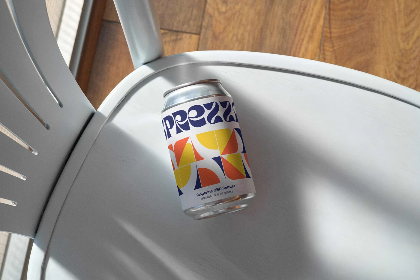
I built the packaging around tropical charm and contemporary appeal, using lively colors and uplifting, playful shapes to evoke the spirit of tropical beaches. Rather than a single flavor look repeated across the line, each can needed to feel vibrant and distinct on shelf while still reading clearly as part of the same family.
The goal throughout was contemporary, not kitschy, so even with bold color and playful shape language, the system stayed clean enough to feel premium rather than novelty. That balance, fun without looking cheap, is often the hardest needle to thread in CPG packaging.
What I learned
Sprezza was a good reminder that category conventions aren’t rules, they’re just what everyone else defaulted to. CBD beverage branding has a pretty narrow visual playbook at this point, and stepping outside of it, toward something more tropical and upbeat, was exactly what made Sprezza distinct on a crowded shelf instead of blending into the same wellness aesthetic as every competitor nearby.
If you’re launching a product in a category with an established visual playbook, it’s worth asking: is that playbook actually right for this brand, or is it just the safe, expected choice everyone defaults to?