Here’s What I Learned Working on the Meridian Financial Brand
Financial brands tend to fall into one of two traps. They either lean so heavily into “trust” that they end up looking like every other bank or advisory firm, or they overcorrect and end up feeling more like a tech startup than a place you’d trust with your retirement. Meridian needed to sit in between: refined, but not cold. Modern, but not trendy.
The approach
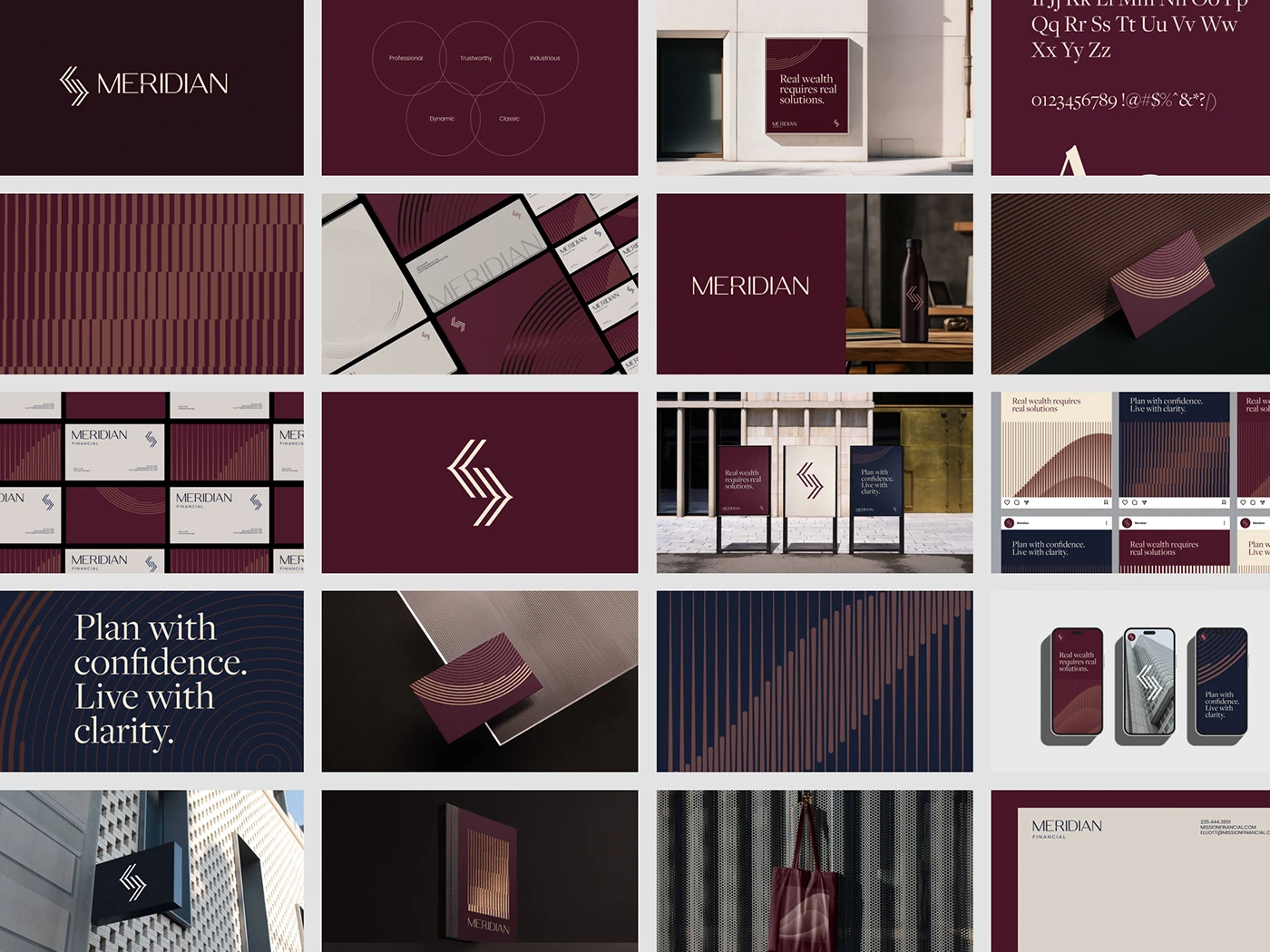
I built the identity around three ideas: clarity, legacy, and forward momentum. Those became the filter for every decision that followed.
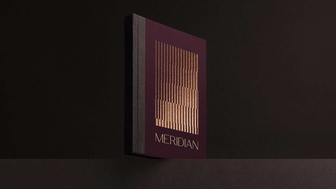
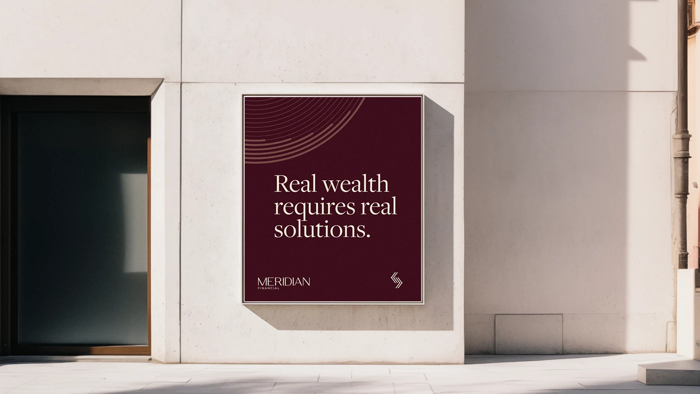
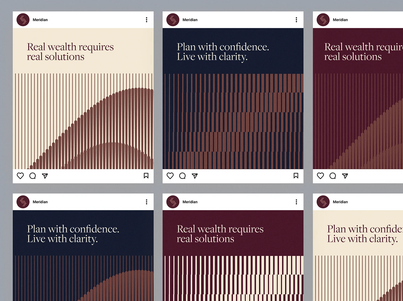
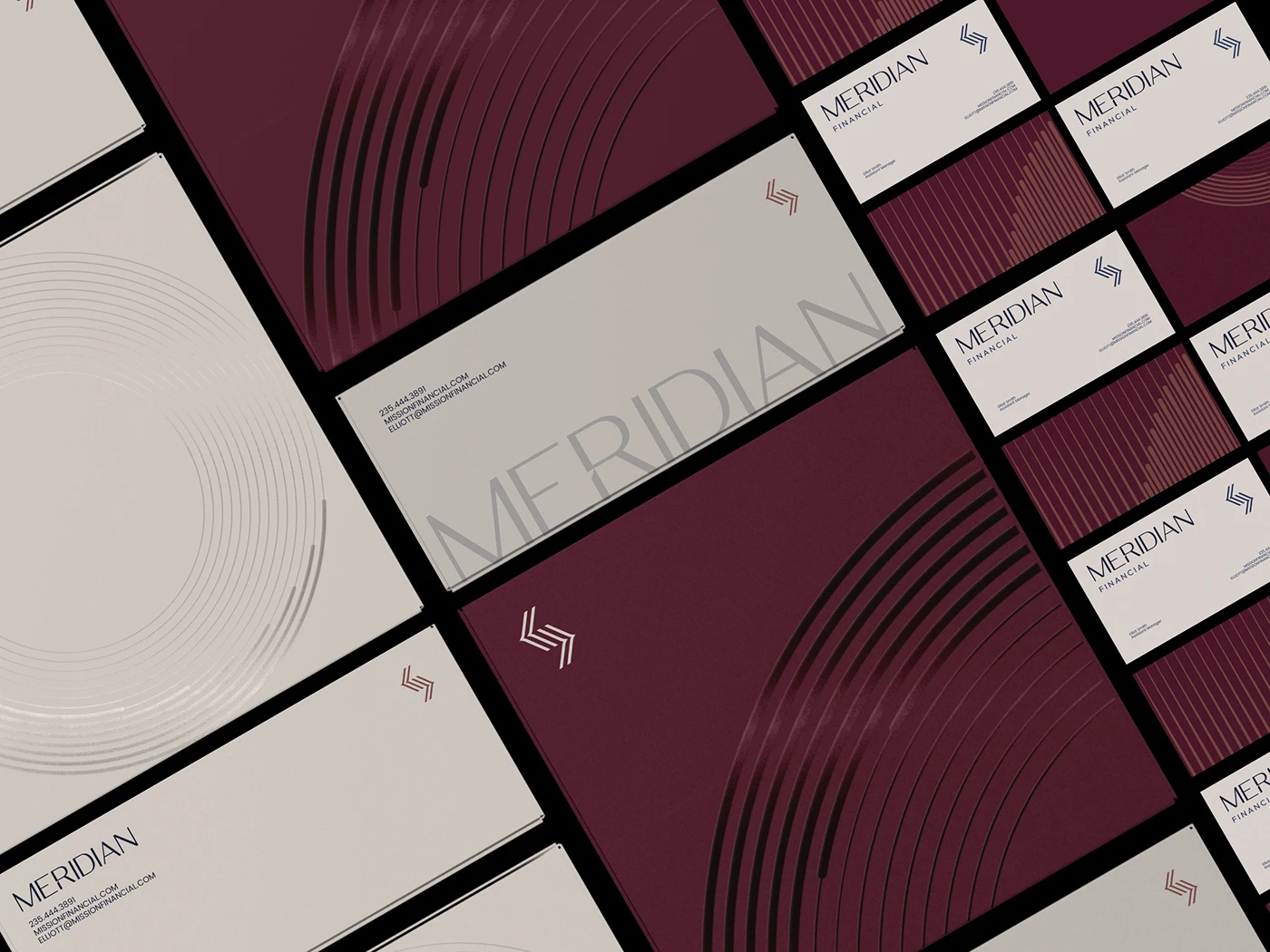
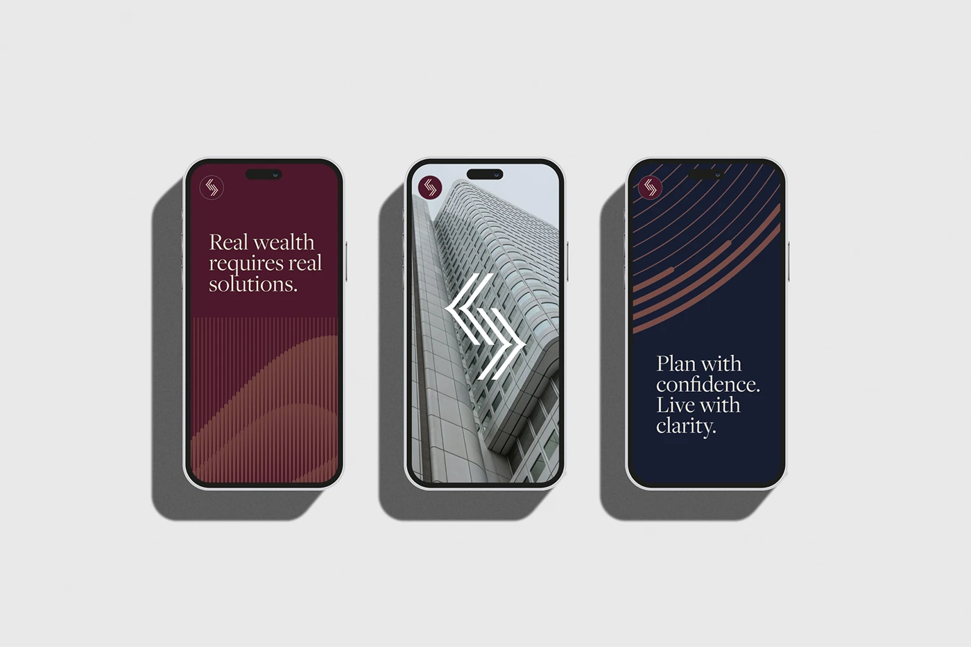
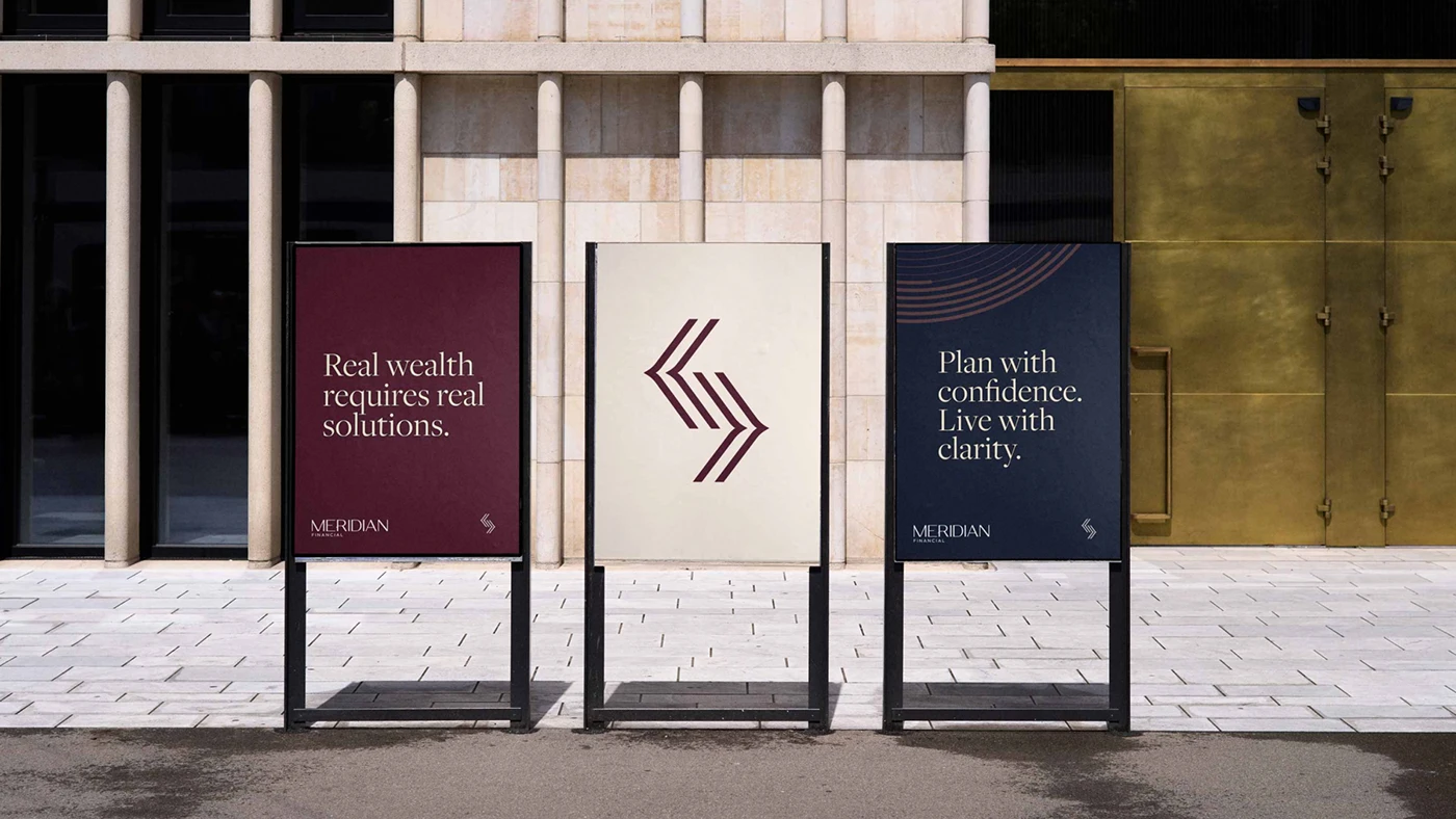
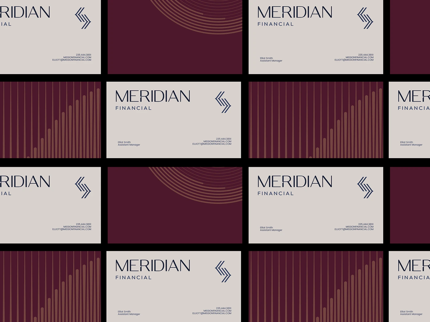
For color, I chose deep reds and copper tones. Reds usually get avoided in finance because people associate them with loss, but a deep, muted red paired with copper reads more like heritage and warmth than risk. It gave the brand permanence without feeling corporate or cold.
For the mark, I built a geometric symbol out of intersecting arrows, meant to represent alignment and direction. It’s a subtle nod to what Meridian actually does: helping people align their finances with where they want to end up. The logotype stayed minimal and timeless on purpose, since a brand about long-term planning shouldn’t look like it’s chasing a trend.
What I learned
The biggest lesson from this one: restraint is a strategy, not a compromise. Every instinct on a project like this pushes you to add more, more texture, more color, more personality. But the brands that actually earn trust are usually the ones that say less and say it more precisely. Meridian’s system works because nothing in it is arbitrary. The color, the mark, the type, all of it ties back to the same three words: clarity, legacy, momentum.
If you’re building a brand in a category where trust is the product, that’s the question worth asking before anything else: what are the two or three ideas everything else needs to serve?